2014
Pellentesque in lacinia quam. Fusce quis nulla tincidunt, interdum magna vitae, viverra est. Nunc eu sodales turpis, varius viverra mauris.
Template Version: 1.12
Created: 30 September 2014
Last updated: 2 Desember 2015
Done by: Congruity Hub
Thank you for purchasing Allec - Bootstrap/LESS Template with Site Builder. If you have any questions that are beyond the scope of this help file, please feel free to contact us via Allec support site.
If you need to edit any Allec predefined page, we are providing you with a general process step by step how to do that in this documentation chapter. Just go through the following steps:
Besides these general steps, please check further information below. Recommendations:
Allec consists of 106 html pages:
This template is based on a default bootstrap 3.3.5 grid system.
All information within the main content area is nested within a body tag. The general template structure is pretty the same throughout the template. Here is the general structure of main page (index.html).
                        <-- Stylesheets -->

                        <-- External css files -->
                        <-- Mobile menu -->
                        <link href="external/z-nav/z-nav.css" rel="stylesheet" />

                        <-- Sliders  -->
                        <-- RS5.0 Main Stylesheet -->
                        <link href="external/rs-plugin/css/settings.css" rel="stylesheet">
                        <-- RS5.0 Layers and Navigation Styles -->
                        <link href="external/rs-plugin/css/layers.css" rel="stylesheet">
                        <link href="external/rs-plugin/css/navigation.css" rel="stylesheet">
                        <-- Royal Slider -->
                        <link href="external/royalslider/royalslider.css" rel="stylesheet" />
                        <-- FlexSlider -->
                        <link href="external/flexslider/flexslider.css" rel="stylesheet" />
                        <-- Original scroll slider -->
                        <link href="external/page-pilling/jquery.pagepilling.css" rel="stylesheet" />
                        <-- Swiper slider -->
                        <link href="external/swiper/idangerous.swiper.css" rel="stylesheet" />
                        <-- mCustomScrollbar -->
                        <link href="external/mCustomScrollbar/jquery.mCustomScrollbar.css" rel="stylesheet" />

                        <-- Isotope  -->
                        <link href="external/isotope/isotope.css" rel="stylesheet" />
                        <-- Magnific-popup -->
                        <link href="external/magnific-popup/magnific-popup.css" rel="stylesheet" />
                        <-- Colorbox -->
                        <link href="external/flickr/colorbox.css" rel="stylesheet" />
                        <-- Wijmo Widgets CSS -->
                        <link href="http://cdn.wijmo.com/jquery.wijmo-pro.all.3.20141.34.min.css" rel="stylesheet" />
                        <-- Select box  -->
                        <link href="external/bootstrap-select/bootstrap-select.css" rel="stylesheet" />
                        <-- Datepicker -->
                        <link href="external/bootstrap-datepicker/datepicker.css" rel="stylesheet" />
                        <-- Nouislider range slider -->
                        <link href="external/range-slider/jquery.nouislider.css" rel="stylesheet" />
                        <-- Raty js -->
                        <link href="external/raty/jquery.raty.css" rel="stylesheet" />
                        <-- Quick product preview -->
                        <link href="external/quickview/css/style.css" rel="stylesheet" />

                        <-- Components styles -->
                        <link href="external/animated-header.css" rel="stylesheet" />
                        <link href="external/tabs/tabs.css" rel="stylesheet" />
                        <link href="external/tabs/tablstyles.css" rel="stylesheet" />
                        <link href="external/tooltip/tooltip-box.css" rel="stylesheet" />
                        <link href="external/tooltip/tooltip-classic.css" rel="stylesheet" />
                        <link href="external/tooltip/tooltip-flip.css" rel="stylesheet" />
                        <link href="external/tooltip/tooltip-line.css" rel="stylesheet" />
                        <link href="external/tooltip/tooltip-round.css" rel="stylesheet" />

                        <-- Custom css files -->
                        <-- IE9 -->
                        <link href="css/ie9.css?v=1" rel="stylesheet" />
                        <-- Touch -->
                        <link href="css/touch.css?v=1" rel="stylesheet" />
                        <-- Style -->
                        <link href="css/style.css?v=1" rel="stylesheet" />
It contains styles for menu view. It has two formats of main menu view:
It contains rules for touchscreen devices. The main purpose of this file is to provide certain hacks for mobile devices and to cancel animation used for desktop version.
Style.css is a generated file from less files. It includes a part of Bootstrap 3.3.5 css and all custom style rules.
Here you can find less files structure:
The rest of css files are needed to display defualt view of components. Most of them are override in the file "style.css".
This template imports 42 Javascript files.
                        <-- Core js files -->
                        <-- jQuery 1.9.1 -->
                        <script src="http://ajax.googleapis.com/ajax/libs/jquery/1.10.1/jquery.min.js"></script>
                        <script>window.jQuery || document.write(‘<script src="external/jquery/jquery-1.10.1.min.js"><\/script>’)</script>
                        <-- jQuery UI -->
                        <script src="http://code.jquery.com/ui/1.10.1/jquery-ui.min.js"></script>
                        <-- Bootstrap 3 -->
                        <script src="http://netdna.bootstrapcdn.com/bootstrap/3.1.1/js/bootstrap.min.js"></script>
                        <-- Modernizr -->
                        <script src="external/modernizr/modernizr.custom.js"></script>

                        <-- Slider -->
                        <-- jQuery REVOLUTION Slider -->
                        <script type="text/javascript" src="external/rs-plugin/js/jquery.themepunch.tools.min.js?rev=5.0"></script>
                        <script type="text/javascript" src="external/rs-plugin/js/jquery.themepunch.revolution.min.js?rev=5.0"></script>
                        <-- Swiper slider -->
                        <script src="external/swiper/idangerous.swiper.js"></script>
                        <-- RoyalSlider -->
                        <script src="external/royalslider/jquery.royalslider.min.js"></script>
                        <-- Flexslider -->
                        <script src="external/flexslider/jquery.flexslider-min.js"></script>
                        <--  Gallery slider with thumb -->
                        <script src="external/galleriffic/jquery.galleriffic.js"></script>
                        <-- Original scroll slider -->
                        <script src="external/page-pilling/jquery.pagepiling.min.js"></script>
                        <-- mCustomScrollbar -->
                        <script src="external/mCustomScrollbar/jquery.mCustomScrollbar.concat.min.js"></script>

                        <-- Files (js) for improve interface -->
                        <-- Mobile menu -->
                        <script src="external/z-nav/jquery.mobile.menu.js"></script>

                        <-- Widgets -->
                        <-- Select box -->
                        <script src="external/bootstrap-select/bootstrap-select.js"></script>
                        <-- Datepicker -->
                        <script src="external/bootstrap-datepicker/bootstrap-datepicker.js"></script>
                        <-- Knob js -->
                        <script src="external/knob/jquery.knob.js"></script>
                        <-- Nouislider range slider -->
                        <script src="external/range-slider/jquery.nouislider.min.js"></script>
                        <-- Charts widget scripts -->
                        <-- Wijmo Widgets JavaScript -->
                        <script src="http://cdn.wijmo.com/jquery.wijmo-open.all.3.20141.34.min.js"></script>
                        <script src="http://cdn.wijmo.com/jquery.wijmo-pro.all.3.20141.34.min.js"></script>
                        <script src="http://cdn.wijmo.com/interop/wijmo.data.ajax.3.20141.34.js"></script>

                        <-- Isotope -->
                        <script src="external/isotope/jquery.isotope.js"></script>
                        <-- Magnific-popup -->
                        <script src="external/magnific-popup/jquery.magnific-popup.min.js"></script>
                        <-- Waypoints -->
                        <script src="external/waypoint/waypoints.min.js"></script>
                        <-- Inview -->
                        <script src="external/inview/jquery.inview.js"></script>
                        <-- Twitter feed -->
                        <script src="external/twitterfeed/twitterfeed.js"></script>
                        <-- Flickr -->
                        <script src="external/flickr/jflickrfeed.js"></script>
                        <-- Colorbox  -->
                        <script src="external/flickr/jquery.colorbox.js"></script>
                        <-- Stars rate -->
                        <script src="external/raty/jquery.raty.js"></script>
                        <-- Product quickview -->
                        <script src="external/quickview/js/velocity.min.js"></script>
                        <script src="external/quickview/js/main.js"></script>
                        <-- Count comimg soon -->
                        <script src="external/count/count.down.js"></script>

                        <-- Maps -->
                        <-- *** Google map  *** -->
                        <script src="https://maps.google.com/maps/api/js?sensor=true"></script>

                        <-- Livicons  -->
                        <script src="external/livicons/livicons-1.3.min.js"></script>
                        <script src="external/livicons/raphael-min.js"></script>
                        <-- Custom tabs -->
                        <script src="external/tabs/cbpFWTabs.js"></script>
                        <-- Scroll to plugin -->
                        <script src="external/scrollto/jquery.scrollTo.min.js"></script>
                        <-- Smooth Scroll -->
                        <script src="external/SmoothScroll/SmoothScroll.js"></script>
                        <-- ClassList -->
                        <script src="external/classList/classList.js"></script>

                        <-- Cansav animation assets -->
                        <script src="external/animated-header/js/TweenLite.min.js"></script>
                        <script src="external/animated-header/js/EasePack.min.js"></script>
                        <script src="external/animated-header/js/rAF.js"></script>
                        <-- Geometry canvas animation -->
                        <script src="external/animated-header/js/header-animate.js"></script>
                        <-- Bubble canvas animation -->
                        <script src="external/animated-header/js/animation-bubble.js"></script>
                        <script src="external/animated-header/js/animation-bubble-fixed.js"></script>
                        <-- Snow canvas animation -->
                        <script src="external/snow/rectangleEmitter.js"></script>
                        <script src="external/snow/snow.js"></script>


                        <-- Form validation -->
                        <script src="js/form.js"></script>
                        <-- Custom -->
                        <script src="js/custom.js"></script>
Here's a list of basic scripts that are used in all template pages:
jQuery is a multi-browser JavaScript library designed to simplify the client-side scripting of HTML.
Powerful mobile-first front-end framework for web development. It connects to the site through CDN "http://netdna.bootstrapcdn.com/bootstrap/3.1.0/css/bootstrap.min.css". You can get more information on official site http://getbootstrap.com/.Allec template uses the range of elements (accordions, tabs, tooltips etc.) which are based on use of this framework. You can find description of these elements here
Modernizr is a JavaScript library that detects HTML5 and CSS3 features in the user's browser.
Designer’s plugin for mobile menu. It has two patterns of interaction with main menu:
It's a file that contain initialization of all third-party plugins and Allec custom code. The file contains set up used on every page and set up for each separate page as a function. You can call functions on every separate page on “script” tag on .html files. Don't forget to call the function, it uses patterns such as "slider".
Here's the rest of scripts that are used in Allec template on different pages:
jQuery UI is a curated set of user interface interactions, effects, widgets, and themes built on top of the jQuery JavaScript Library. In this template, it is used to make wijmo widgets work properly.
Revolution slider is a responsive third-party jQuery plugin. Detailed documentation of which you can find at Revolution slider official documentation.
Swiper slider is a third-party mobile touch slider with hardware accelerated transitions (where supported) and amazing native behavior. Detailed documentation of which you can find at Swiper Slider official website.
RoyalSlider is an image gallery and content slider plugin. Every slider template is responsive and touch friendly. More information and API you can find in Royal Slider online documentation.
FlexSlider is a free responsive jQuery slider toolkit. Supported in all major browsers with custom navigation options and touch swipe support. As it is a third-party plugin, you can find its detailed documentation at FlexSlider official website.
It is a third-party plugin for execution of thumbnail gallery. It is used in the template on page single-product.html and single-product-full.html to represent shop item. But this shortcode is reusable and can be use in any other page. To add additional settings in gallery display you are recommended to read plugin's online documentation
It is highly customizable custom scrollbar jQuery plugin. Features include vertical and/or horizontal scrollbar(s), adjustable scrolling momentum, mouse-wheel (via jQuery mousewheel plugin), keyboard and touch support, ready-to-use themes and customization via CSS, RTL direction support, option parameters for full control of scrollbar functionality, methods for triggering actions like scroll-to, update, destroy etc., user-defined callbacks. Detailed information about this third-party plugin you can find at its official website.
The script presupposes 3 objectives:
jQuery Raty is a third-party plugin that generates a customizable star rating. More information about setting you can find at its official website
jQuery Knob is a third-party canvas based plugin that enables you to create different sort of pie charts. It supports touch, mouse and mousewheel, keyboard events and is downward compatible. More information you can find at its official website.
It is a simple JavaScript API for producing an accurate, intuitive description of the timespan between two date instances. More information on this matter you can find at plugin's official website
Magnific Popup is a responsive lightbox & dialog script with focus on performance and providing best experience for user with any device. Plugin documentation have full information about customization.
It is a custom select for Bootstrap using button dropdown. If you need more information regarding this element you can find it at plugin's official website
Bootstrap-datepicker provides a flexible datepicker widget in the Twitter bootstrap style. These are the specific versions bootstrap-datepicker is tested against (js files) and built against (css files). Use other versions at your own risk. Documentation. Also you can configurate datepicker for your needs use online generator.
Wijmo is a kit of UI widgets based on jQuery UI. The template uses three types of widgets: pie chart, bar chart and linear graph (with time axis). You can find information about other widgets at Wijimo official website. To find out additional settings of pie chart follow this link. You can find documentation concerning linear graph after this link. If you want to design widgets by your own you should keep in mind that svg tags use specific css rules, therefore it is recommended to read documentation concerning this issue.
noUiSlider is a third-party plugin that allows to create a range slider without bloat. It supports responsive and draggable performance. It is suitable if you would like to create a price range etc. You can find extra information how this plugin works at its official website.
It is a third-party plugin that can hide and show item elements via the filter option. Items that match that filter will be shown. Items that do not match will be hidden. This technic is used in the page "Fullwidth gallery". More details about availble configuration find at Isotope official website.
Waypoints is a jQuery plugin that makes it easy to execute a function whenever you scroll to an element. This plugin use data-attribute to define type of animation for each direction.
This plugin works by pulling a JSON feed from Flickr and applying the data it gets back to a template. As it is a third-party plugin, you may find detailed information about it in its online documentation.
Colorbox is a jQuery plugin, meaning that it extends the jQuery JavaScript library to include extra functionality. It is used for better perfomance of popups in this template. More information about this plugin you may find at its official website.
Livicons are animated vector icons (except brand names ones), so there are not any images like JPGs, PNGs or GIFs. All their appearance and behaviour are based on Javascript program code. So they can be animated or static, with any color and size with good look at usual and high resolution devices. Livicons are being created with SVG (Scalable Vector Graphic) in all modern browsers and VML (Vector Markup Language) in IE6 - IE8. Documentation and step by step using can be found at its official website .
A lightweight script to animate scrolling to anchor links.More information you can find in its documentation.
The script serves to add Google map on a template page. You can find step by step instruction of map insertion in its documentation.
Script that allows to download recent news from twitter account to your website. You can find information how to adjust this scropt to your own account in FAQs section of this documentation.
Script that will be triggered when the element is scrolled in to the viewport. Allec uses checkups for assignment for blocks of animation effects when they appear in displaying area. Plugin development is in open-source on github.
Allec contains 85 psd files:
All psd files are easy to edit and adjust due to your needs.
The template uses three fonts. One of them (Font Awesome) is iconic font. It allows you to display icons in crossbrowsing and crossplatforming ways. Also you can display animated icon by using livicons script (details in FAQs section of this documentation). Two text fonts are also attached - Open Sans and VarelaRound. They both are generated through Google Fonts.
This template is based on scalable and modular principles. Most elements are built like code templates.You can put this templates in any place in the page. It gives a default pattern view. You can add an additional class (class modificator) to the pattern root tag. It will give an alternative view.
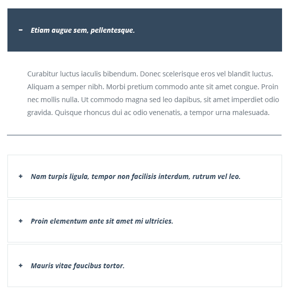
Three are 4 kinds of shortcodes for accordions. Block class accordion will represent default view bootstrap accordion. For custom configuration you can add a class-modificator accordion--blocks.
Curabitur luctus iaculis bibendum. Donec scelerisque eros vel blandit luctus. Aliquam a semper nibh. Morbi pretium commodo ante sit amet congue. Proin nec mollis nulla. Ut commodo magna sed leo dapibus, sit amet imperdiet odio gravida. Quisque rhoncus dui ac odio venenatis, a tempor urna malesuada.
... *
* - the rest of code can be found in file accordions.html.
Result:
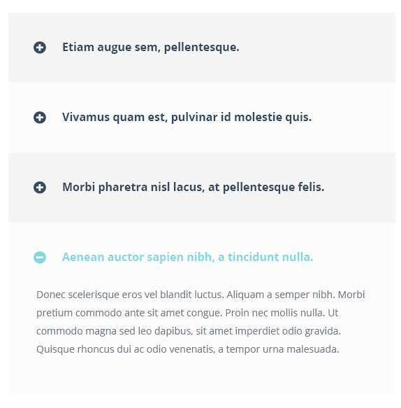
Here's another variant of accordion style. You shoud add class-modificator accordion--stack to css class panel-group accordion accordion--blocks.
Result:
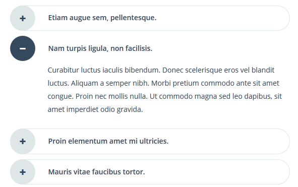
Adding class-modificator acoordion--smooth you will get style of accordion as shown below.
Result:
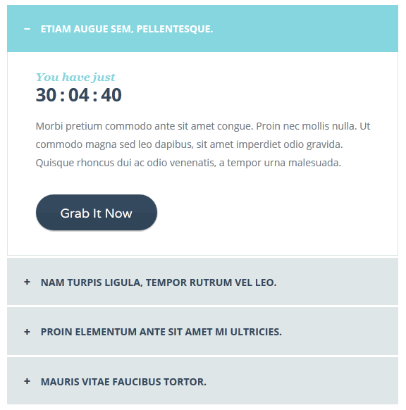
If you want accordin with counter add class-modificator accordion--offer and code:
                                <h4 class="panel-title">


                                    Etiam augue sem, pellentesque.


                                  You have just


                                          hours


                                          minutes


                                          seconds


                                   Morbi pretium commodo ante sit amet congue. Proin nec mollis nulla. Ut commodo magna sed leo dapibus, sit amet imperdiet odio gravida. Quisque rhoncus dui ac odio venenatis, a tempor urna malesuada.

                                  Grab It Now


                            ... *
* - the rest of code can be found in file accordions.html.
Result:
There are 4 types of alert. They have block class alert and it adds positioning set of rules. Also you have 4 class-modificators for changing alert color scheme: alert-success, alert-info, alert-danger, alert-warning.
                          Well done! You successfully read this important alert message.


                          Information for you! This alert is not super important.


                          Oh snap! Change a few things up and try submitting again.


                          Warning! Best check yourself, you're not looking too good.
Adding the code above you will get such kind of alerts as shown below.
Result:

Allec Template has different styles of buttons. They have the main class btn which gives the typography style and hover effects. Also you have 6 class-modificators for changing button color: btn-info, btn-warning, btn-primary, btn-danger, btn-success, btn-general and 2 class-modificators for changing button size: btn-lg (normal size), btn-sm (small size).
                        Button
                        Button
                        Button
                        Button
                        Button
                        Button
Adding the code above you will get such kind of buttons as shown below.
Result:

First style. Adding class-modificator btn--decorated you will get a style shown below.
Result:

Second style. Add this construction to display round bordered buttons with special hover effect in your website.
Adding the code above you will get such kind of buttons as shown below.
Result:

Third style. Add this construction to display buttons with icon in your website.
                            Button


                            Button


                            Button


                            Button


                            Button


                            Button
Adding the code above you will get such kind of buttons as shown below.
Result:

Fourth style. Add this construction to display bordered buttons with icon in your website.
Adding the code above you will get such kind of buttons as shown below.
Result:

Fifth style. Add this construction to display small round buttons in your website.
                        Small Button
                        Small Button
                        Small Button
                        Small Button
                        Small Button
                        Small Button
Adding the code above you will get such kind of buttons as shown below.
Result:

Sixth style. Add this construction to display small rectangle buttons in your website.
                        Small Button
                        Small Button
                        Small Button
                        Small Button
                        Small Button
                        Small Button
Adding the code above you will get such kind of buttons as shown below.
Result:

Seventh style. Add this construction to display small bordered buttons in your website.
Adding the code above you will get such kind of buttons as shown below.
Result:

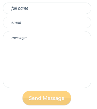
In this section you get default pattern for contact form. Block class is contact. If you want to add this shortcode to your page, you should change an attribute action to send.php and add a link to js file form.js.
Adding the code above you will get such kind of contact form as shown below.
Result:
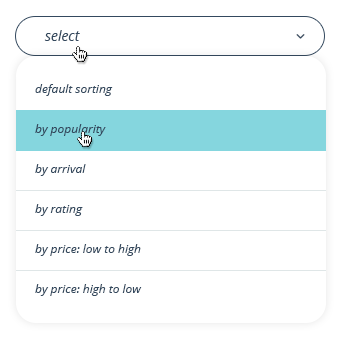
Custom select configuration can be enabled by using "bootstrap-selectbox". Default styles are represent with block class select.
Adding the code above you will get such kind of select as shown below.
Result:
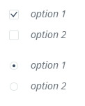
Allec template has custom style for ckeckbox and radio buttons. Add this construction with block classes checkbox and radio to display such kind of checkboxes and radio buttons in your website.
Adding the code above you will get Allec custom checkboxes and radio buttons as shown below.
Result:
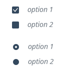
You can change the color scheme for checkbox and radio buttons, just add a class-modificator checkbox--dark and radio--dark after block class.
Result:
Default icons show pure icons without decoration. If you want to change it, you shoud add a suitable class-modificator. You can combine all representation modes with animated icons - livicons. More details about livicons you can find in section JavaScrtipt and FAQ's.
Adding the code above you will get pure icons painted in solid color as shown below.
Result:
Adding class-modificator icon--strips you will get a style shown below.
Result:
Adding class-modificator icon--circle you will get icons on circle background as shown below.
Result:
Adding class-modificator icon--rect you will get icons on square background as shown below.
Result:
Adding class-modificator icon--shape you will get icons imbeded into pie-shape background as shown below.
Result:
Adding class-modificator icon--border you will get icons imbeded into thick border as shown below.
Result:
There are several variants of image container style in Allec template. Each img tag has a container with block class image-container. This method enhances block scalable system that allows to add images in any block of the template pages. The below is base for all other images styles in Allec template.
<img src="images/sample/6.jpg" alt="">
Adding the code above you will get plain square image container as shown below.
Result:

You can add additional class-modificators to the initial class to get more sophisticated styles of image containers.
First style. Adding class-modificator image-container--border-inner to the basic class image-container you will get image with inner frame.
<img src="images/sample/6.jpg" alt="">
You need just to add the code above into your page to get image style shown below.
Result:

Second style. Adding class-modificator image-container--fading to the basic class image-container you will get faded image with date information.
<img src="images/sample/6.jpg" alt="">
You need just to add the code above into your page to get image style shown below.
Result:

Third style. Adding class-modificator image-container--describe to the basic class image-container you will get image with description information below.
<img src="images/sample/6.jpg" alt="">
You need just to add the code above into your page to get image style shown below.
Result:

Fourth style. Adding class-modificator image-container--empty to the basic class image-container you will get framed image with thin 1 px border and white space.
<img src="images/sample/6.jpg" alt="">
You need just to add the code above into your page to get image style shown below.
Result:
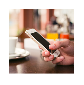
Fifth style. Adding class-modificator image-container--expository to the basic class image-container you will get framed image with description information below.
<img src="images/sample/6.jpg" alt="">
You need just to add the code above into your page to get image style shown below.
Result:

Sixth style. Adding class-modificator image-container--border to the basic class image-container you will get image wrapped with 1 px border.
<img src="images/sample/6.jpg" alt="">
You need just to add the code above into your page to get image style shown below.
Result:

Seventh style. Adding class-modificator image-container--border-huge to the basic class image-container you will get image wrapped with thick stroke.
<img src="images/sample/6.jpg" alt="">
You need just to add the code above into your page to get image style shown below.
Result:

Lists are an important part for content presentation in all pages. Allec template has several list views. Main class for it is called list. Here's a default code to show lists in your website.
Adding the code above for a default list style you will get a list shown below. This type of list is called a unordered list. Its main tag is ul.
Result:
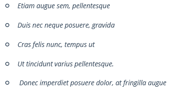
If your case requires ordered list (numerated one), you need to use tag ol. Here's an example of code for such kind of lists:
- Etiam augue sem, pellentesque
- Duis nec neque posuere, gravida
- Cras felis nunc, tempus ut
- Ut tincidunt varius pellentesque.
- Donec imperdiet posuere dolor, at fringilla augue
The code above will alow you to get a style shown below.
Result:
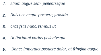
You also can use different classes-modificators for certain unordered list display.
First style.Add class-modificator list--sign to the main unordered list class list as shown in the code below to get arrow in a circle as a marker.
Using this code above will allow you to get style shown below.
Result:
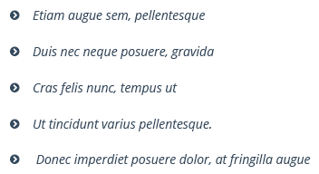
Second style. Add class-modificator list--check to the main unordered list class list as shown in the code below to get check list marker.
Using this code above will allow you to get style shown below.
Result:

Third style. Add class-modificator list--arrow to the main unordered list class list as shown in the code below to get long arrow as a marker.
Using this code above will allow you to get style shown below.
Result:

Fourth style. Add class-modificator list--expanded to the main unordered list class list as shown in the code below to get very customized marker which is suitable for a large amount of text as a list.
Using this code above will allow you to get style shown below.
Result:

Pagination ui elements are mostly used in blog and gallery pages of the site. Here's below a default code that is used in Allec template to represent pagination.
Using the code above in your page, you get style shown in the screenshot below.
Result:

You can change Allec default view of pagination adding suitable class-modificator.
First style. Add class-modificator pagination--rect to the main class pagination to get style where every ui control element is embedded into a rectangle as shown in the code below.
Using the code above in your page, you get style shown in the screenshot below.
Result:

Second style. Add class-modificator pagination--minimal to the main class pagination to get clean and minimal style as shown in the code below.
Using the code above in your page, you get style shown in the screenshot below.
Result:

Third style. Add class-modificator pagination--circle to the main class pagination to get style where every ui control element is embedded into stroked circle as shown in the code below.
Using the code above in your page, you get style shown in the screenshot below.
Result:

Allec shortcodes for progress bar are based on Bootstrap component. Here's an example of code that refers to default progress bar in Allec template. The main class for this ui element is progress-container.
Using the code above in your page, you get style shown in the screenshot below.
Result:

You can change Allec default view of progress bar adding suitable class-modificator.
First style. Add class-modificator progress--secondary to the main class progress-container to get style embedded into rounded container as shown in the code below.
Using the code above in your page, you get style shown in the screenshot below.
Result:

Second style. Add class-modificator progress--primary to the main class progress-container to get rounded style as shown in the code below.
Using the code above in your page, you get style shown in the screenshot below.
Result:

Third style. Add class-modificator progress--neutral to the main class progress-container to get simple rectangle style as shown in the code below.
Using the code above in your page, you get style shown in the screenshot below.
Result:

Here you find 3 variants of table styles. All of them are wrapped into tag div with class table-responsive. It gives opportunity to add scroll for tables on mobile devices. Each table style in Allec template has different class-mofificators.
First style. Add class-modificator table--vertical to the class of tag table to get two-column table as shown in the code below.
                                      Resolution
                                      1920 x 1080
                                      1920 x 1080


                                      Energy efficiency rating
                                      A+
                                      A+


                                      On-mode power consumption
                                      115 W
                                      115 W


                                      Annual power consumption
                                      160 kWh
                                      160 kWh


                                      Screen technology
                                      LED backlit
                                      LED backlit
Using the code above in your page, you get style shown in the screenshot below.
Result:

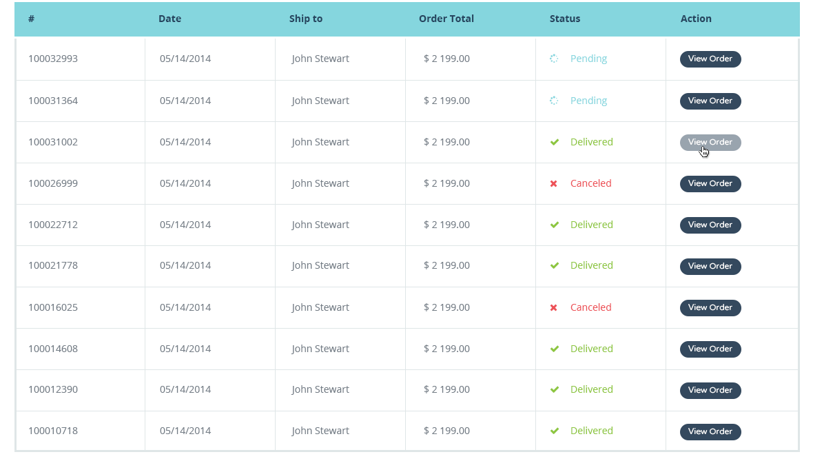
Second style. Add class-modificator table--wide to the class of tag table to get large table with multiple columns as shown in the code below.
						                    #
						                    Date
						                    Ship to
						                    Order Total
						                    Status
						                    Action


						                  100032993
						                  05/14/2015
						                  John Stewart
						                  $ 2 199.00
						                   Pending
						                  View Order


						                  100031364
						                  05/14/2015
						                  John Stewart
						                  $ 2 199.00
						                   Pending
						                  View Order


						                  100031002
						                  05/14/2015
						                  John Stewart
						                  $ 2 199.00
						                  Delivered
						                  View Order


						                  100026999
						                  05/14/2015
						                  John Stewart
						                  $ 2 199.00
						                   Canceled
						                  View Order


						                  100022712
						                  05/14/2015
						                  John Stewart
						                  $ 2 199.00
						                  Delivered
						                  View Order
Using the code above in your page, you get similar style to what is shown in the screenshot below.
Result:
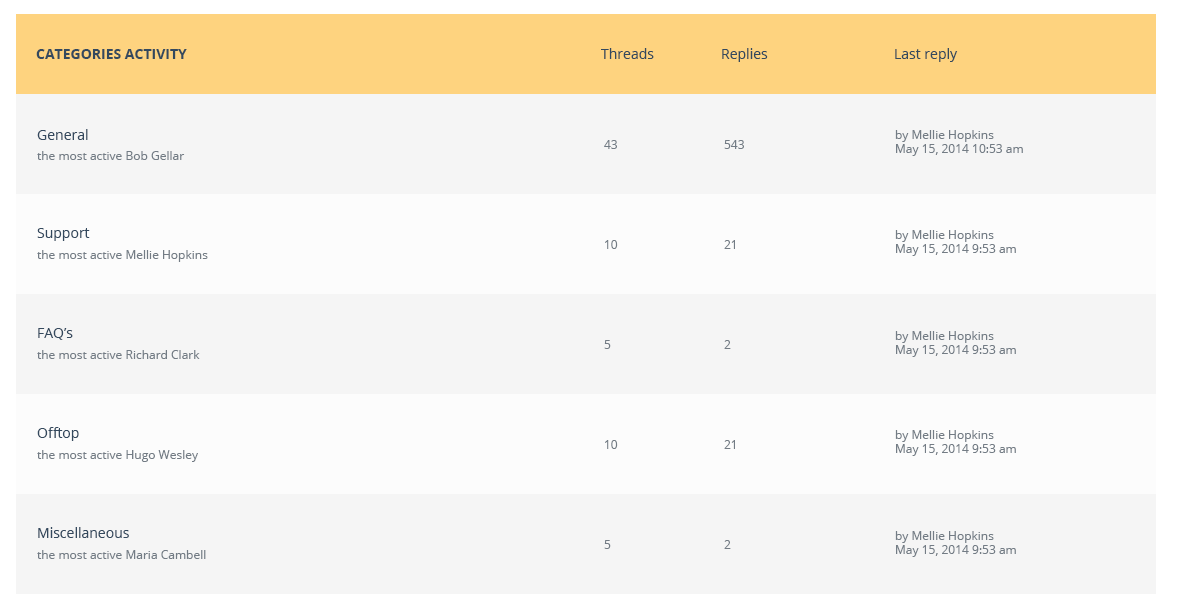
Third style. Add class-modificator table--target to the class of tag table to get table style focused on rows as shown in the code below.
						                    Categories activity
						                    Threads
						                    Replies
						                    Last reply


						                  General the most active Bob Gellar
						                  43
						                  543
						                  by Mellie Hopkins May 15, 2015 10:53 am


						                  Supportthe most active Mellie Hopkins
						                  10
						                  21
						                  by Mellie Hopkins May 15, 2015 10:53 am


						                  FAQ’sthe most active Richard Clark
						                  5
						                  2
						                  by Mellie Hopkins May 15, 2015 10:53 am


						                  Offtopthe most active Hugo Wesley
						                  10
						                  21
						                  by Mellie Hopkins May 15, 2015 10:53 am


						                  Miscellaneousthe most active Maria Cambell
						                  5
						                  2
						                  by Mellie Hopkins May 15, 2015 10:53 am
Using the code above in your page, you get similar style to what is shown in the screenshot below.
Result:
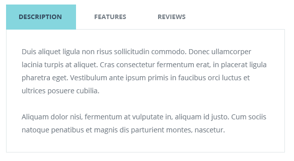
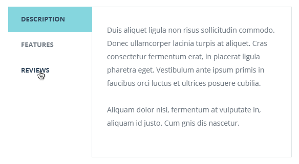
Tabs shortcodes have been built based on Bootstrap tabs components. The main class for this block is tabs. Here's an example of code responsible for default tabs style.
Nam auctor dapibus ante vel facilisis. Cras eget adipiscing nisi. Duis aliquet ligula non risus sollicitudin commodo. Donec ullamcorper lacinia turpis at aliquet. Cras consectetur fermentum erat, in placerat ligula pharetra eget. Vestibulum ante ipsum primis in faucibus orci luctus et ultrices posuere cubilia Curae; Aliquam dolor nisi, fermentum at vulputate in, aliquam id justo. Cum sociis natoque penatibus et magnis dis parturient montes, nascetur ridiculus mus. Nullam et accumsan ante, et consequat neque. Fusce quis molestie eros.
Cras consectetur fermentum erat, in placerat ligula pharetra eget. Vestibulum ante ipsum primis in faucibus orci luctus et ultrices posuere cubilia Curae; Aliquam dolor nisi, fermentum at vulputate in, aliquam id justo. Cum sociis natoque penatibus et magnis dis parturient montes, nascetur ridiculus mus. Nullam et accumsan ante, et consequat neque. Fusce quis molestie eros.Nam auctor dapibus ante vel facilisis. Cras eget adipiscing nisi. Duis aliquet ligula non risus sollicitudin commodo. Donec ullamcorper lacinia turpis at aliquet.
Donec ullamcorper lacinia turpis at aliquet. Cras consectetur fermentum erat, in placerat ligula pharetra eget. Vestibulum ante ipsum primis in faucibus orci luctus et ultrices posuere cubilia Curae; Aliquam dolor nisi, fermentum at vulputate in, aliquam id justo. Cum sociis natoque penatibus et magnis dis parturient montes, nascetur ridiculus mus. Nullam et accumsan ante, et consequat neque. Fusce quis molestie eros. Nam auctor dapibus ante vel facilisis. Cras eget adipiscing nisi. Duis aliquet ligula non risus sollicitudin commodo.
Using the code above in your page, you get style as shown in the screenshot below.
Result:
You can change Allec default view of tabs adding suitable class-modificator.
First style. Add class-modificator tabs--minimal to the main class tabs to get minimal tabs style as shown in the code below.
Nam auctor dapibus ante vel facilisis. Cras eget adipiscing nisi. Duis aliquet ligula non risus sollicitudin commodo. Donec ullamcorper lacinia turpis at aliquet. Cras consectetur fermentum erat, in placerat ligula pharetra eget. Vestibulum ante ipsum primis in faucibus orci luctus et ultrices posuere cubilia Curae; Aliquam dolor nisi, fermentum at vulputate in, aliquam id justo. Cum sociis natoque penatibus et magnis dis parturient montes, nascetur ridiculus mus. Nullam et accumsan ante, et consequat neque. Fusce quis molestie eros.
Cras consectetur fermentum erat, in placerat ligula pharetra eget. Vestibulum ante ipsum primis in faucibus orci luctus et ultrices posuere cubilia Curae; Aliquam dolor nisi, fermentum at vulputate in, aliquam id justo. Cum sociis natoque penatibus et magnis dis parturient montes, nascetur ridiculus mus. Nullam et accumsan ante, et consequat neque. Fusce quis molestie eros.Nam auctor dapibus ante vel facilisis. Cras eget adipiscing nisi. Duis aliquet ligula non risus sollicitudin commodo. Donec ullamcorper lacinia turpis at aliquet.
Donec ullamcorper lacinia turpis at aliquet. Cras consectetur fermentum erat, in placerat ligula pharetra eget. Vestibulum ante ipsum primis in faucibus orci luctus et ultrices posuere cubilia Curae; Aliquam dolor nisi, fermentum at vulputate in, aliquam id justo. Cum sociis natoque penatibus et magnis dis parturient montes, nascetur ridiculus mus. Nullam et accumsan ante, et consequat neque. Fusce quis molestie eros. Nam auctor dapibus ante vel facilisis. Cras eget adipiscing nisi. Duis aliquet ligula non risus sollicitudin commodo.
Using the code above in your page, you get style as shown in the screenshot below.
Result:

Second style. Add class-modificator tabs--minimal-vertical to the main class tabs to get vertical minimal tabs style as shown in the code below.
Nam auctor dapibus ante vel facilisis. Cras eget adipiscing nisi. Duis aliquet ligula non risus sollicitudin commodo. Donec ullamcorper lacinia turpis at aliquet. Cras consectetur fermentum erat, in placerat ligula pharetra eget. Vestibulum ante ipsum primis in faucibus orci luctus et ultrices posuere cubilia Curae; Aliquam dolor nisi, fermentum at vulputate in, aliquam id justo. Cum sociis natoque penatibus et magnis dis parturient montes, nascetur ridiculus mus. Nullam et accumsan ante, et consequat neque. Fusce quis molestie eros.
Cras consectetur fermentum erat, in placerat ligula pharetra eget. Vestibulum ante ipsum primis in faucibus orci luctus et ultrices posuere cubilia Curae; Aliquam dolor nisi, fermentum at vulputate in, aliquam id justo. Cum sociis natoque penatibus et magnis dis parturient montes, nascetur ridiculus mus. Nullam et accumsan ante, et consequat neque. Fusce quis molestie eros.Nam auctor dapibus ante vel facilisis. Cras eget adipiscing nisi. Duis aliquet ligula non risus sollicitudin commodo. Donec ullamcorper lacinia turpis at aliquet.
Donec ullamcorper lacinia turpis at aliquet. Cras consectetur fermentum erat, in placerat ligula pharetra eget. Vestibulum ante ipsum primis in faucibus orci luctus et ultrices posuere cubilia Curae; Aliquam dolor nisi, fermentum at vulputate in, aliquam id justo. Cum sociis natoque penatibus et magnis dis parturient montes, nascetur ridiculus mus. Nullam et accumsan ante, et consequat neque. Fusce quis molestie eros. Nam auctor dapibus ante vel facilisis. Cras eget adipiscing nisi. Duis aliquet ligula non risus sollicitudin commodo.
Using the code above in your page, you get style as shown in the screenshot below.
Result:
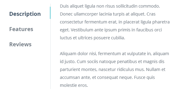
Third style. Add class-modificator tabs--vertical to the main class tabs to get default vertical tabs style as shown in the code below.
Nam auctor dapibus ante vel facilisis. Cras eget adipiscing nisi. Duis aliquet ligula non risus sollicitudin commodo. Donec ullamcorper lacinia turpis at aliquet. Cras consectetur fermentum erat, in placerat ligula pharetra eget. Vestibulum ante ipsum primis in faucibus orci luctus et ultrices posuere cubilia Curae; Aliquam dolor nisi, fermentum at vulputate in, aliquam id justo. Cum sociis natoque penatibus et magnis dis parturient montes, nascetur ridiculus mus. Nullam et accumsan ante, et consequat neque. Fusce quis molestie eros.
Cras consectetur fermentum erat, in placerat ligula pharetra eget. Vestibulum ante ipsum primis in faucibus orci luctus et ultrices posuere cubilia Curae; Aliquam dolor nisi, fermentum at vulputate in, aliquam id justo. Cum sociis natoque penatibus et magnis dis parturient montes, nascetur ridiculus mus. Nullam et accumsan ante, et consequat neque. Fusce quis molestie eros.Nam auctor dapibus ante vel facilisis. Cras eget adipiscing nisi. Duis aliquet ligula non risus sollicitudin commodo. Donec ullamcorper lacinia turpis at aliquet.
Donec ullamcorper lacinia turpis at aliquet. Cras consectetur fermentum erat, in placerat ligula pharetra eget. Vestibulum ante ipsum primis in faucibus orci luctus et ultrices posuere cubilia Curae; Aliquam dolor nisi, fermentum at vulputate in, aliquam id justo. Cum sociis natoque penatibus et magnis dis parturient montes, nascetur ridiculus mus. Nullam et accumsan ante, et consequat neque. Fusce quis molestie eros. Nam auctor dapibus ante vel facilisis. Cras eget adipiscing nisi. Duis aliquet ligula non risus sollicitudin commodo.
Using the code above in your page, you get style as shown in the screenshot below.
Result:
Allec Template has also custom tabs with icons. The main class for this block is tabs-custom. Here's an example of code responsible for default tabs style.
First style. Add class-modificator tabs-style-flip to the main class tabs-custom and construction below to get flip tabs.
Duis aliquet ligula non risus sollicitudin commodo. Donec ullamcorper lacinia turpis at aliquet. Cras consectetur fermentum erat, in placerat ligula pharetra eget. Vestibulum ante ipsum primis in faucibus orci luctus et ultrices posuere cubilia.
Aliquam dolor nisi, fermentum at vulputate in, aliquam id justo. Cum sociis natoque penatibus et magnis dis parturient montes, nascetur.
Aliquam dolor nisi, fermentum at vulputate in, aliquam id justo. Cum sociis natoque penatibus et magnis dis parturient montes, nascetur.
Duis aliquet ligula non risus sollicitudin commodo. Donec ullamcorper lacinia turpis at aliquet. Cras consectetur fermentum erat, in placerat ligula pharetra eget. Vestibulum ante ipsum primis in faucibus orci luctus et ultrices posuere cubilia.
Cras consectetur fermentum erat, in placerat ligula pharetra eget. Vestibulum ante ipsum primis in faucibus orci luctus et ultrices posuere cubilia. Aliquam dolor nisi, fermentum at vulputate in, aliquam id justo. Cum sociis natoque penatibus et magnis dis parturient montes, nascetur.
Duis aliquet ligula non risus sollicitudin commodo. Donec ullamcorper lacinia turpis at aliquet.
Vestibulum ante ipsum primis in faucibus orci luctus et ultrices posuere cubilia. Cum sociis natoque penatibus et magnis dis parturient montes, nascetur.
Duis aliquet ligula non risus sollicitudin commodo. Donec ullamcorper lacinia turpis at aliquet. Aliquam dolor nisi, fermentum at vulputate in, aliquam id justo. Cras consectetur fermentum erat, in placerat ligula pharetra eget.
Duis aliquet ligula non risus sollicitudin commodo. Donec ullamcorper lacinia turpis at aliquet.
Cras consectetur fermentum erat, in placerat ligula pharetra eget. Vestibulum ante ipsum primis in faucibus orci luctus et ultrices posuere cubilia. Aliquam dolor nisi, fermentum at vulputate in, aliquam id justo. Cum sociis natoque penatibus et magnis dis parturient montes, nascetur.
Using the code above in your page, you get style as shown in the screenshot below.
Result:

Second style. Add class-modificator tabs-style-topline to the main class tabs-custom and construction below to get tabs with top line on active tab.
Duis aliquet ligula non risus sollicitudin commodo. Donec ullamcorper lacinia turpis at aliquet. Cras consectetur fermentum erat, in placerat ligula pharetra eget. Vestibulum ante ipsum primis in faucibus orci luctus et ultrices posuere cubilia.
Aliquam dolor nisi, fermentum at vulputate in, aliquam id justo. Cum sociis natoque penatibus et magnis dis parturient montes, nascetur.
Aliquam dolor nisi, fermentum at vulputate in, aliquam id justo. Cum sociis natoque penatibus et magnis dis parturient montes, nascetur.
Duis aliquet ligula non risus sollicitudin commodo. Donec ullamcorper lacinia turpis at aliquet. Cras consectetur fermentum erat, in placerat ligula pharetra eget. Vestibulum ante ipsum primis in faucibus orci luctus et ultrices posuere cubilia.
Cras consectetur fermentum erat, in placerat ligula pharetra eget. Vestibulum ante ipsum primis in faucibus orci luctus et ultrices posuere cubilia. Aliquam dolor nisi, fermentum at vulputate in, aliquam id justo. Cum sociis natoque penatibus et magnis dis parturient montes, nascetur.
Duis aliquet ligula non risus sollicitudin commodo. Donec ullamcorper lacinia turpis at aliquet.
Vestibulum ante ipsum primis in faucibus orci luctus et ultrices posuere cubilia. Cum sociis natoque penatibus et magnis dis parturient montes, nascetur.
Duis aliquet ligula non risus sollicitudin commodo. Donec ullamcorper lacinia turpis at aliquet. Aliquam dolor nisi, fermentum at vulputate in, aliquam id justo. Cras consectetur fermentum erat, in placerat ligula pharetra eget.
Duis aliquet ligula non risus sollicitudin commodo. Donec ullamcorper lacinia turpis at aliquet.
Cras consectetur fermentum erat, in placerat ligula pharetra eget. Vestibulum ante ipsum primis in faucibus orci luctus et ultrices posuere cubilia. Aliquam dolor nisi, fermentum at vulputate in, aliquam id justo. Cum sociis natoque penatibus et magnis dis parturient montes, nascetur.
Using the code above in your page, you get style as shown in the screenshot below.
Result:

Third style. Add class-modificator tabs-style-iconbox to the main class tabs-custom and construction below to get tabs with full-width header
Using the code above in your page, you get style as shown in the screenshot below.
Result:

Fourth style. Add class-modificator tabs-style-circle to the main class tabs-custom and construction below to get clear tabs
Home. Duis aliquet ligula non risus sollicitudin commodo. Donec ullamcorper lacinia turpis at aliquet. Cras consectetur fermentum erat, in placerat ligula pharetra eget. Vestibulum ante ipsum primis in faucibus orci luctus et ultrices posuere cubilia.
Aliquam dolor nisi, fermentum at vulputate in, aliquam id justo. Cum sociis natoque penatibus et magnis dis parturient montes, nascetur.
Profile. Aliquam dolor nisi, fermentum at vulputate in, aliquam id justo. Cum sociis natoque penatibus et magnis dis parturient montes, nascetur.
Duis aliquet ligula non risus sollicitudin commodo. Donec ullamcorper lacinia turpis at aliquet. Cras consectetur fermentum erat, in placerat ligula pharetra eget. Vestibulum ante ipsum primis in faucibus orci luctus et ultrices posuere cubilia.
Attachments. Cras consectetur fermentum erat, in placerat ligula pharetra eget. Vestibulum ante ipsum primis in faucibus orci luctus et ultrices posuere cubilia. Aliquam dolor nisi, fermentum at vulputate in, aliquam id justo. Cum sociis natoque penatibus et magnis dis parturient montes, nascetur.
Duis aliquet ligula non risus sollicitudin commodo. Donec ullamcorper lacinia turpis at aliquet.
Projects Vestibulum ante ipsum primis in faucibus orci luctus et ultrices posuere cubilia. Cum sociis natoque penatibus et magnis dis parturient montes, nascetur.
Duis aliquet ligula non risus sollicitudin commodo. Donec ullamcorper lacinia turpis at aliquet. Aliquam dolor nisi, fermentum at vulputate in, aliquam id justo. Cras consectetur fermentum erat, in placerat ligula pharetra eget.
Settings. Duis aliquet ligula non risus sollicitudin commodo. Donec ullamcorper lacinia turpis at aliquet.
Cras consectetur fermentum erat, in placerat ligula pharetra eget. Vestibulum ante ipsum primis in faucibus orci luctus et ultrices posuere cubilia. Aliquam dolor nisi, fermentum at vulputate in, aliquam id justo. Cum sociis natoque penatibus et magnis dis parturient montes, nascetur.
Using the code above in your page, you get style as shown in the screenshot below.
Result:

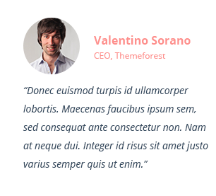
Testimonial shortcodes have a block class testimonial. If you want to change default view you should just add class-modificator.
<img src="images/avatars/1.jpg" alt="">
CEO, Themeforest
“Donec euismod turpis id ullamcorper lobortis. Maecenas faucibus ipsum sem, sed consequat ante consectetur non. Nam at neque dui. Integer id risus sit amet justo varius semper quis ut enim.”
Using the code above in your page, you get style as shown in the screenshot below.
Result:
You can change Allec default view of testimonial adding suitable class-modificator.
First style. Add class-modificator testimonial--centered to the main class testimonial to get centered style in framed container as shown in the code below.
<img src="images/avatars/1.jpg" alt="">
CEO, Themeforest
“Donec euismod turpis id ullamcorper lobortis. Maecenas faucibus ipsum sem, sed consequat ante consectetur non. Nam at neque dui. Integer id risus sit amet justo varius semper quis ut enim.”
Using the code above in your page, you get style as shown in the screenshot below.
Result:

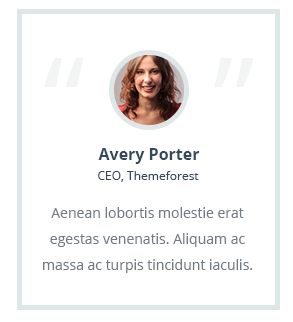
Second style. Add class-modificator testimonial--border to the main class testimonial to get testimonial framed in container with thick stroke as shown in the code below.
<img src="images/avatars/1.jpg" alt="">
CEO, Themeforest
“Donec euismod turpis id ullamcorper lobortis. Maecenas faucibus ipsum sem, sed consequat ante consectetur non. Nam at neque dui. Integer id risus sit amet justo varius semper quis ut enim.”
Using the code above in your page, you get style as shown in the screenshot below.
Result:
Third style. Add class-modificator testimonial--string to the main class testimonial to get testimonial on colored background without person's image as shown in the code below.
<img src="images/avatars/1.jpg" alt="">
CEO, Themeforest
“Donec euismod turpis id ullamcorper lobortis. Maecenas faucibus ipsum sem, sed consequat ante consectetur non. Nam at neque dui. Integer id risus sit amet justo varius semper quis ut enim.”
Using the code above in your page, you get style as shown in the screenshot below.
Result:

There are 6 types of tooltips. Every tooltip block has default style without class-modificator. And they, also, have 3 class-modificators for changing tooltip color scheme: tooltip--secondary, tooltip--bordered, tooltip--shadow.
First style. Tooltip block tooltip-link to get classic simple style as shown in the code below.
Aenean porta, elit vitae tristique consequat, nisi tooltip 1 tellus tincidunt erat, sit amet interdum elit quam at velit. Mauris venenatis metus sed purus tincidunt placerat. Quisque lobortis tortor tooltip 2 et nisi commodo, at malesuada nunc sollicitudin. Curabitur quis ultrices tortor tooltip 3. Mauris porta erat vitae mauris tooltip 4 facilisis pellentesque. Praesent sed ornare ligula. Nunc at faucibus ante. Cras pellentesque diam eu porta egestas.
Adding the code above you will get such kind of tooltips as shown below.
Result:

Second style. Tooltip block tooltip-classic to get classic expended style as shown in the code below.
                        Aenean porta, elit vitae tristique consequat, nisi

                                tooltip 1

                                    <img src="../images/tooltip/sample.jpg" />

                                        Nemo enim ipsam voluptatem quia voluptas sit aspernatur aut odit aut fugit, sed quia consequuntur.


                            tellus tincidunt erat, sit amet interdum elit quam at velit. Mauris venenatis metus sed purus tincidunt placerat. Quisque lobortis tortor

                                tooltip 2

                                    <img src="../images/tooltip/sample.jpg" />

                                        Nemo enim ipsam voluptatem quia voluptas sit aspernatur aut odit aut fugit, sed quia consequuntur.


                            et nisi commodo, at malesuada nunc sollicitudin. Curabitur quis ultrices tortor

                                tooltip 3

                                    <img src="../images/tooltip/sample.jpg" />

                                        Nemo enim ipsam voluptatem quia voluptas sit aspernatur aut odit aut fugit, sed quia consequuntur.


                            . Mauris porta erat vitae mauris facilisis pellentesque. Praesent sed ornare ligula. Nunc at faucibus ante. Cras pellentesque diam eu porta egestas.
Adding the code above you will get such kind of tooltips as shown below.
Result:

Third style. Add class-modificator tooltip-round to the main class tooltip-link to get round style as shown in the code below.
Aenean porta, elit vitae tristique consequat, nisi tooltip 1 tellus tincidunt erat, sit amet interdum elit quam at velit. Mauris venenatis metus sed purus tincidunt placerat. Quisque lobortis tortor tooltip 2 et nisi commodo, at malesuada nunc sollicitudin. Curabitur quis ultrices tortor tooltip 3. Mauris porta erat vitae mauris tooltip 4 facilisis pellentesque. Praesent sed ornare ligula. Nunc at faucibus ante. Cras pellentesque diam eu porta egestas.
Adding the code above you will get such kind of tooltips as shown below.
Result:

Fourth style.Tooltip block tooltip-box to get boxed style as shown in the code below.
                        Aenean porta, elit vitae tristique consequat, nisi

                                tooltip 1


                                        Nemo enim ipsam voluptatem quia voluptas sit aspernatur aut odit aut fugit, sed quia consequuntur.
                                        Some Link


                        tellus tincidunt erat, sit amet interdum elit quam at velit. Mauris venenatis metus sed purus tincidunt placerat. Quisque lobortis tortor

                                tooltip 2


                                        Nemo enim ipsam voluptatem quia voluptas sit aspernatur aut odit aut fugit, sed quia consequuntur.
                                        Some Link


                        et nisi commodo, at malesuada nunc sollicitudin. Curabitur quis ultrices tortor

                                tooltip 3


                                        Nemo enim ipsam voluptatem quia voluptas sit aspernatur aut odit aut fugit, sed quia consequuntur.
                                        Some Link


                        . Mauris porta erat vitae mauris facilisis pellentesque. Praesent sed ornare ligula. Nunc at faucibus ante. Cras pellentesque diam eu porta egestas.
Adding the code above you will get such kind of tooltips as shown below.
Result:

Fifth style. Add class-modificator tooltip-line to the main class tooltip-link to get round style as shown in the code below.
                        Aenean porta, elit vitae tristique consequat, nisi

                                tooltip 1


                                        Nemo enim ipsam voluptatem quia voluptas sit aspernatur aut odit aut fugit, sed quia consequuntur.


                        tellus tincidunt erat, sit amet interdum elit quam at velit. Mauris venenatis metus sed purus tincidunt placerat. Quisque lobortis tortor

                                tooltip 2


                                        Nemo enim ipsam voluptatem quia voluptas sit aspernatur aut odit aut fugit, sed quia consequuntur.


                        et nisi commodo, at malesuada nunc sollicitudin. Curabitur quis ultrices tortor

                                tooltip 3


                                        Nemo enim ipsam voluptatem quia voluptas sit aspernatur aut odit aut fugit, sed quia consequuntur.


                        . Mauris porta erat vitae mauris facilisis pellentesque. Praesent sed ornare ligula. Nunc at faucibus ante. Cras pellentesque diam eu porta egestas.
Adding the code above you will get such kind of tooltips as shown below.
Result:

Sixth style. Add class-modificator tooltip-flip to the main class tooltip-link to get tooltip with image as shown in the code below.
                        Aenean porta, elit vitae tristique consequat, nisi

                            tooltip 1

                                    <img src="../images/tooltip/avatar1.jpg" alt="user1"/>
                                    Sophie Cooper


                        tellus tincidunt erat, sit amet interdum elit quam at velit. Mauris venenatis metus sed purus tincidunt placerat. Quisque lobortis tortor

                            tooltip 2

                                    <img src="../images/tooltip/avatar2.jpg" alt="user2"/ >
                                    Anton Price


                        et nisi commodo, at malesuada nunc sollicitudin. Curabitur quis ultrices tortor

                            tooltip 3

                                    <img src="../images/tooltip/avatar3.jpg" alt="user3"/>
                                    Rebecca Banks


                        . Mauris porta erat vitae mauris

                            tooltip 4

                                    <img src="../images/tooltip/avatar4.jpg" alt="user4"/>
                                    Benjamin Green


                        facilisis pellentesque. Praesent sed ornare ligula. Nunc at faucibus ante. Cras pellentesque diam eu porta egestas.
Adding the code above you will get such kind of tooltips as shown below.
Result:

There are several variants of divider style in Allec template. Main class for it is called divider. Here's a default code to show divider in your website.
Adding the code above you will get default divider as shown below.
Result:

Add class-modificator divider--double to the main class divider to get double line style as shown in the code below.
Adding the code above you will get such kind of divider as shown below.
Result:

Add class-modificator divider--double-dotted to the main class divider to get double dotted line style as shown in the code below.
Adding the code above you will get such kind of divider as shown below.
Result:

Add class-modificator divider--dotted to the main class divider to get dotted one line style as shown in the code below.
Adding the code above you will get such kind of divider as shown below.
Result:

Add class-modificator divider--colored to the main class divider to get line with colored circles on the center as shown in the code below.
Adding the code above you will get such kind of divider as shown below.
Result:

Add class-modificator divider--icon to the main class divider to get line with icon on the center as shown in the code below.
Adding the code above you will get such kind of divider as shown below.
Result:

Other the main class divider-brand gives divider with color line on the center
Adding the code above you will get such kind of divider as shown below.
Result:

Allec Template has 5 types of sequence.
First style. Add class-modificator sequence--clickable to the main class sequence to get round style as shown in the code below.
                                    {1}
                                    Research


                                    {2}
                                    Prototyping


                                    {3}
                                    Design


                                    {4}
                                    Development


                                    {5}
                                    Result
Adding the code above you will get such kind of sequence as shown below.
Result:

Second style. Add class-modificator sequence--colored to the main class sequence to get colored round style as shown in the code below.
Adding the code above you will get such kind of sequence as shown below.
Result:

Third style. Add class-modificator sequence--progress to the main class sequence to get progress style as shown in the code below.
                                    Done


                                    2
                                    Prototyping


                                    3
                                    Design


                                    4
                                    Development


                                    5
                                    Result
Adding the code above you will get such kind of sequence as shown below.
Result:

Fourth style. Add class-modificator sequence--progress-alt to the main class sequence and sequence--progress to get alternative progress style as shown in the code below.
                                    Done


                                    2
                                    Prototyping


                                    3
                                    Design


                                    4
                                    Development


                                    5
                                    Result
Adding the code above you will get such kind of sequence as shown below.
Result:

Fifth style. Add class-modificator sequence--progress-commerce to the main class sequence and sequence--progress to get commerce progress style as shown in the code below.
                                    review cart


                                    enter shipping info


                                    enter billing info


                                    complete payment


                                    ordered
Adding the code above you will get such kind of sequence as shown below.
Result:

If you want to use breadcrumbs on the page, paste the code below after header section on your page:
<h2 class="heading">Notifications</h2>
Adding the code above you will get breadcrumb as shown below.
Result:

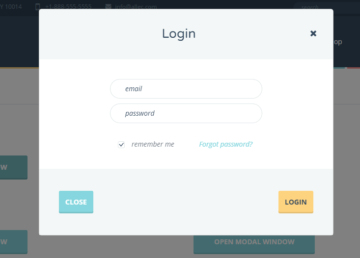
Modal window shortcodes have been built based on Bootstrap modal components. Here's an example of code responsible for default modal window style.
                          <div class="modal" id="modal">
                            <div class="modal-dialog">
                              <div class="modal-content">
                                <div class="modal-header">
                                  <button type="button" class="close" data-dismiss="modal">

                                </div>

                                <div class="modal-body">

                                </div>

                                <div class="modal-footer">

                                </div>
                              </div>
                            </div>
                          </div>
Adding the code above you will get modal window as shown below.
Result:
Every window could has a fade effect. There are effects available in Allec: fade fade--in, fade fade--zoom, fade fade--scale, fade fade--flip
Note! All this patterns and their code you can find in demo html files in folder "shortcodes". This is main shortcodes, but you should remember that many other parts of code can be reused in many pages. You can combine elements as you need without losing quality.
Allec template has a special file for starting work on a new page using elements you need from other pages. It is page-constructor.html. This file contains default pattern for header with full working navigation block and footer with working twitter feed.
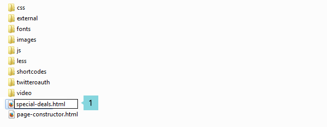
                                   <h2 class="block-title block-title--simple block-title--bottom-s block-title--top-middle">Special Deals</h2>


                                    Lorem ipsum dolor sit amet, consectetur adipiscing elit. Pellentesque in lacinia quam. Fusce quis nulla tincidunt, interdum magna vitae, viverra est. Nunc eu sodales turpis, varius viverra mauris.

                                    $40
                                    Grab It Now
<!-- COPY YOUR CODE OF BLOCK BELOW -->).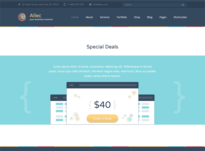
There is a list of reusable, reliable and separated blocks that you can use with page-constructor.html. You can combine all these blocks as you need.
Here's an example of code that refers to Default fullwidth slider in Allec template.
<h2 class="full-placeholeder__headind slider__heading">Just Awesome
&
Worth to Try</h2>
Download Now
Great pixel perfect template which suites any needs. Some subheader text goes here.
Note! Don't forget to change the path to your images.
Additionally you need to include stylesheet for this slider in <head> tag:
                        <link rel="stylesheet" href="external/rs-plugin/css/settings.css">

                        <link rel="stylesheet" href="external/rs-plugin/css/layers.css">
                        <link rel="stylesheet" href="external/rs-plugin/css/navigation.css">
And javascript file at bottom of page (before closed tag <body>):
                        <script src="external/rs-plugin/js/jquery.themepunch.tools.min.js?rev=5.0">
                        <script src="external/rs-plugin/js/jquery.themepunch.revolution.min.js?rev=5.0">

                        <script>
                            $(document).ready(function() {
                                revDefault();
                            });
                        </script>
Using the code above in your page, you get style as shown in the screenshot below.
Result:
Here's an example of code that refers to Default fullwidth shop slider in Allec template.
<h2 class="slider__heading--sm-danger">Only on Allec May Offer</h2>
<h2 class="slider__heading--lg-primary">Best Pack of the Month</h2>
 Grab It Now
Note! Don't forget to change the path to your images.
Additionally you need to include stylesheet for this slider in <head> tag:
                        <link rel="stylesheet" href="external/rs-plugin/css/settings.css">

                        <link rel="stylesheet" href="external/rs-plugin/css/layers.css">
                        <link rel="stylesheet" href="external/rs-plugin/css/navigation.css">
And javascript file at the bottom of the page (before closed tag <body>):
                        <script src="external/rs-plugin/js/jquery.themepunch.tools.min.js?rev=5.0">
                        <script src="external/rs-plugin/js/jquery.themepunch.revolution.min.js?rev=5.0">

                        <script>
                            $(document).ready(function() {
                                revAlternative();
                            });
                        </script>
Using the code above in your page, you get style as shown in the screenshot below.
Result:
Here's an example of code that refers to Feature block in Allec template.
<h3 class="not-visible">Main conrainer</h3>
Additionally you need to include javascript code at the bottom of the page (before closed tag <body>):
                        <script>
                            $(document).ready(function() {
                                featureSlider();
                            });
                        </script>
Using the code above in your page, you get style as shown in the screenshot below.
Result: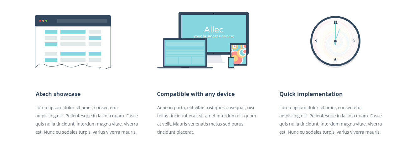
Here's an example of code that refers to Number block (count active) in Allec template.
                                <h2 class="block-title block-title--simple" id="number-start">Allec in Numbers</h2>


                                            download
                                            0


                                            spent hours
                                            0


                                            countries
                                            0


                                            loyal clients
                                            0
Additionally you need to include javascript file and code at the bottom of the page (before closed tag <body>):
                        <script src="external/inview/jquery.inview.js"></script>

                         <script>
                            $(document).ready(function() {
                                numberStart();
                            });
                        </script>
Using the code above in your page, you get style as shown in the screenshot below.
Result:
Here's an example of code that refers to Fading slider in Allec template.
<h2 class="block-title block-title--top-larger">Available Services</h2>
Additionally you need to include javascript file at the bottom of the page (before closed tag <body>):
fadingSlider();
Using the code above in your page, you get style as shown in the screenshot below.
Result:
Here's an example of code that refers to Video block in Allec template.
<h2 class="block-title block-title--simple block-title--bottom-s block-title--top-large">Check Allec in Action</h2>
- Etiam augue sem, pellentesque
- Duis nec neque posuere, gravida
- Cras felis nunc, tempus ut
- Ut tincidunt varius pellentesque. Aenean laoreet nibh et nulla
- Donec imperdiet posuere dolor, at fringilla augue
- Etiam augue sem, pellentesque
- Duis nec neque posuere, gravida
- Cras felis nunc, tempus ut
- Ut tincidunt varius pellentesque. Aenean laoreet nibh et nulla
- Donec imperdiet posuere dolor, at fringilla augue
Note! Replace src attribute value in iframe to isert your video.
Using the code above in your page, you get style as shown in the screenshot below.
Result: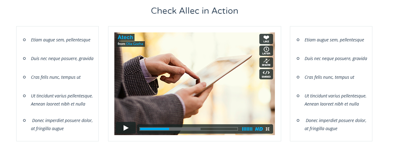
Here's an example of code that refers to Service block (small service icon) in Allec template.
                            <h2 class="block-title block-title--top-larger">Available Services</h2>


                                            <h3 class="service__heading">Made with Love</h3>


                                        Lorem ipsum dolor sit amet, consectetur adipiscing elit. Pellentesque in lacinia quam. Fusce quis nulla tincidunt, interdum magna vitae, viverra est. Nunc eu sodales turpis, varius viverra mauris.


                                            <h3 class="service__heading">Fully Customizable</h3>


                                        Nullam lacinia nibh et nisi luctus rhoncus. Cras vitae purus volutpat, rhoncus mauris quis, elementum neque. In cursus magna eget consequat placerat. Nulla facilisi.


                                            <h3 class="service__heading">Premium-class Support</h3>


                                        Sed eget placerat arcu. Nullam porta faucibus ligula, egestas tempus tellus dapibus tincidunt. Nunc vitae interdum massa. Nam in augue quis elit sagittis accumsan.


                                            <h3 class="service__heading">Reasonable Price</h3>


                                        Lorem ipsum dolor sit amet, consectetur adipiscing elit. Pellentesque in lacinia quam. Fusce quis nulla tincidunt, interdum magna vitae, viverra est. Nunc eu sodales turpis, varius viverra mauris.


                                            <h3 class="service__heading">Efficient Workflow</h3>


                                        Sed eget placerat arcu. Nullam porta faucibus ligula, egestas tempus tellus dapibus tincidunt. Nunc vitae interdum massa. Nam in augue quis elit sagittis accumsan.


                                            <h3 class="service__heading">Innovative Technologies</h3>


                                        Sed eget placerat arcu. Nullam porta faucibus ligula, egestas tempus tellus dapibus tincidunt. Nunc vitae interdum massa. Nam in augue quis elit sagittis accumsan.
Using the code above in your page, you get style as shown in the screenshot below.
Result: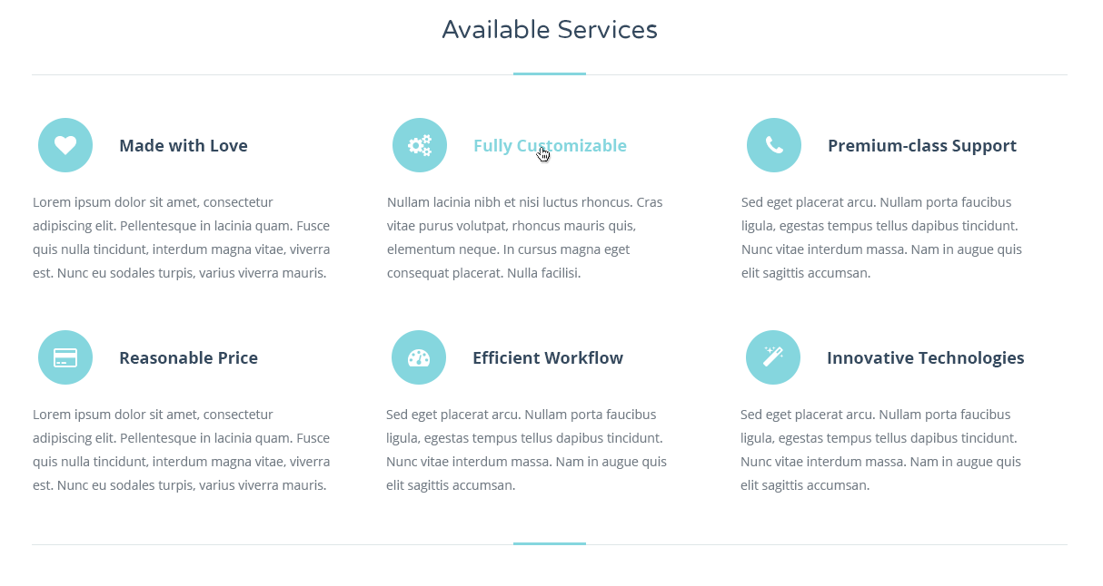
Here's an example of code that refers to Service block (large service icon) in Allec template.
                            <h2 class="block-title block-title--top-larger">We Offer You</h2>


                                                <h3 class="service__heading">Cloud Computing</h3>


                                            Lorem ipsum dolor sit amet, consectetur adipiscing elit. Pellentesque in lacinia quam. Fusce quis nulla tincidunt, interdum magna vitae, viverra est.


                                                <h3 class="service__heading">Large Network</h3>


                                            Fusce in posuere lorem. Proin eleifend viverra orci, at blandit arcu feugiat mollis. Nunc congue erat ornare metus congue venenatis.


                                                <h3 class="service__heading">Good Mood</h3>


                                            Phasellus scelerisque nunc dolor, at adipiscing purus molestie sollicitudin. Phasellus accumsan mi ultricies lorem feugiat sodales vitae sed turpis.


                                                <h3 class="service__heading">Prompt Launch</h3>


                                            Fusce diam nibh, sollicitudin eu fringilla eget, consequat tincidunt purus. Phasellus accumsan mi ultricies lorem feugiat sodales vitae sed turpis.
Using the code above in your page, you get style as shown in the screenshot below.
Result: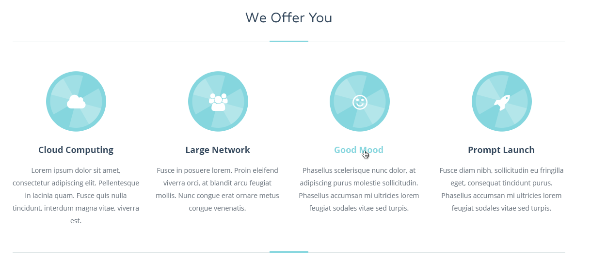
Here's an example of code that refers to Service block with step description in Allec template.
                                            01
                                            <h2 class="service-step__heading">Responsive Web Design</h2>
                                            Integer vel sollicitudin justo. Morbi odio ligula, imperdiet eget placerat nec, suscipit id urna. Aliquam erat volutpat. Cras vel sollicitudin felis. Curabitur erat eros, consectetur eu nibh ac, sodales commodo nisl.raesent placerat sed purus ac ullamcorper. Phasellus quis libero in tortor hendrerit facilisis sed sit amet nunc.


                                            <img src="images/gallery/thumbs-full/1.jpg" alt="">


                                            <img src="images/sample/22.jpg" alt="">


                                            02
                                            <h2 class="service-step__heading">Individual Approach</h2>
                                            Donec eget molestie neque, dapibus lacinia elit. Aenean non erat et metus pulvinar dapibus. Maecenas eros erat, blandit eget arcu in, interdum ultricies neque. Praesent egestas tortor vitae congue luctus. Integer leo turpis, venenatis et lectus non, dictum egestas nibh. Phasellus rutrum odio quis sem dapibus.


                                            <img src="images/blog/full-width/9.jpg" alt="">


                                            <img src="images/gallery/thumbs-full/20.jpg" alt="">


                                            03
                                            <h2 class="service-step__heading">Spectaculous Support</h2>
                                            Donec eget molestie neque, dapibus lacinia elit. Aenean non erat et metus pulvinar dapibus. Maecenas eros erat, blandit eget arcu in, interdum ultricies neque. Praesent egestas tortor vitae congue luctus. Integer leo turpis, venenatis et lectus non, dictum egestas nibh. Phasellus rutrum odio quis sem dapibus.


                                            <img src="images/blog/full-width/7.jpg" alt="">


                                            <img src="images/blog/full-width/8.jpg" alt="">
Using the code above in your page, you get style as shown in the screenshot below.
Result: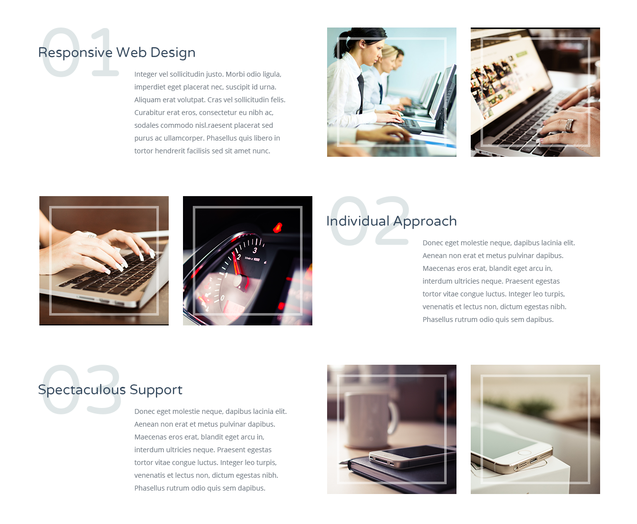
Here's an example of code that refers to Service block with presentation images in Allec template.
                                        <img src="images/services/1.jpg" alt="">


                                                <h3 class="service__heading">Cloud Computing</h3>


                                            Lorem ipsum dolor sit amet, consectetur adipiscing elit. Pellentesque in lacinia quam. Fusce quis nulla tincidunt, interdum magna vitae, viverra est.


                                                <h3 class="service__heading">Large Network</h3>


                                            Fusce in posuere lorem. Proin eleifend viverra orci, at blandit arcu feugiat mollis. Nunc congue erat ornare metus congue venenatis.


                                                <h3 class="service__heading">Prompt Launch</h3>


                                            Fusce diam nibh, sollicitudin eu fringilla eget, consequat tincidunt purus. Phasellus accumsan mi ultricies lorem feugiat sodales vitae sed turpis.


                                        <img src="images/services/2.jpg" alt="">


                                                <h3 class="service__heading">Web Design</h3>


                                            Lorem ipsum dolor sit amet, consectetur adipiscing elit. Pellentesque in lacinia quam. Fusce quis nulla tincidunt, interdum magna vitae, viverra est.


                                                <h3 class="service__heading">App Design</h3>


                                            Fusce in posuere lorem. Proin eleifend viverra orci, at blandit arcu feugiat mollis. Nunc congue erat ornare metus congue venenatis.


                                                <h3 class="service__heading">Development</h3>


                                            Fusce in posuere lorem. Proin eleifend viverra orci, at blandit arcu feugiat mollis. Nunc congue erat ornare metus congue venenatis.
Using the code above in your page, you get style as shown in the screenshot below.
Result: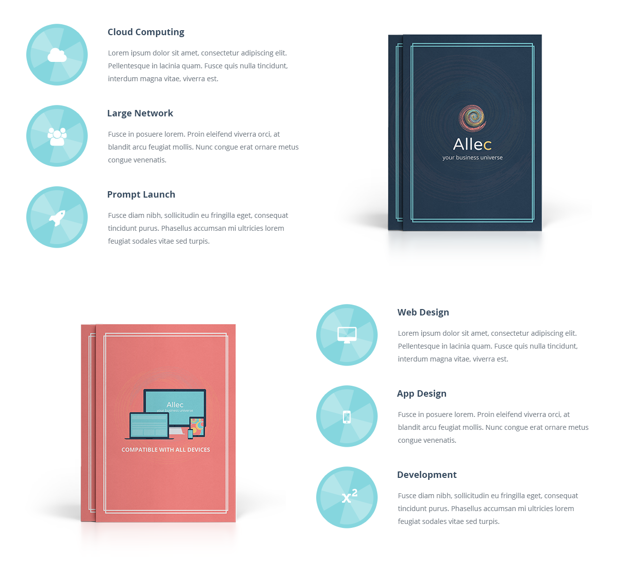
Here's an example of code that refers to Service block with icons shadow in Allec template.
                                                <h3 class="service__heading">Cloud Computing</h3>


                                            Sed in lacus adipiscing, dictum elit viverra, ultricies mi. Aliquam quis placerat massa. Mauris at augue erat.


                                                <h3 class="service__heading">Large Network</h3>


                                            Praesent fermentum accumsan vulputate. Sed velit nulla, sagittis non erat id, dictum vestibulum ligula.


                                                <h3 class="service__heading">Prompt Launch</h3>


                                            Maecenas congue dui id posuere fermentum. Morbi at iaculis nibh, at semper augue.


                                                <h3 class="service__heading">Web Design</h3>


                                            Phasellus venenatis ligula in faucibus consequat. Aliquam dictum nulla eu varius porta.
Using the code above in your page, you get style as shown in the screenshot below.
Result:
Here's an example of code that refers to Block with special offer in Allec template.
                            <2 class="block-title block-title--simple block-title--bottom-s block-title--top-middle">Special Deals</h2>


                            Lorem ipsum dolor sit amet, consectetur adipiscing elit. Pellentesque in lacinia quam. Fusce quis nulla tincidunt, interdum magna vitae, viverra est. Nunc eu sodales turpis, varius viverra mauris.

                            $40
                            Grab It Now
Using the code above in your page, you get style as shown in the screenshot below.
Result:
Here's an example of code that refers to Block with special offer (extend version) in Allec template.
                                    <h2 class="block-title block-title--simple block-title--bottom-s">Today’s Special Deal</h2>


                                            <img class="offer__images" src="images/components/dashboard1.png" alt="">
                                            regular price


                                            <img class="offer__images" src="images/components/dashboard2.png" alt="">
                                            today’s discount


                                    Lorem ipsum dolor sit amet, consectetur adipiscing elit. Pellentesque in lacinia quam. Fusce quis nulla tincidunt, interdum magna vitae, viverra est. Nunc eu sodales turpis, varius viverra mauris.


                                    Get It Now
Using the code above in your page, you get style as shown in the screenshot below.
Result: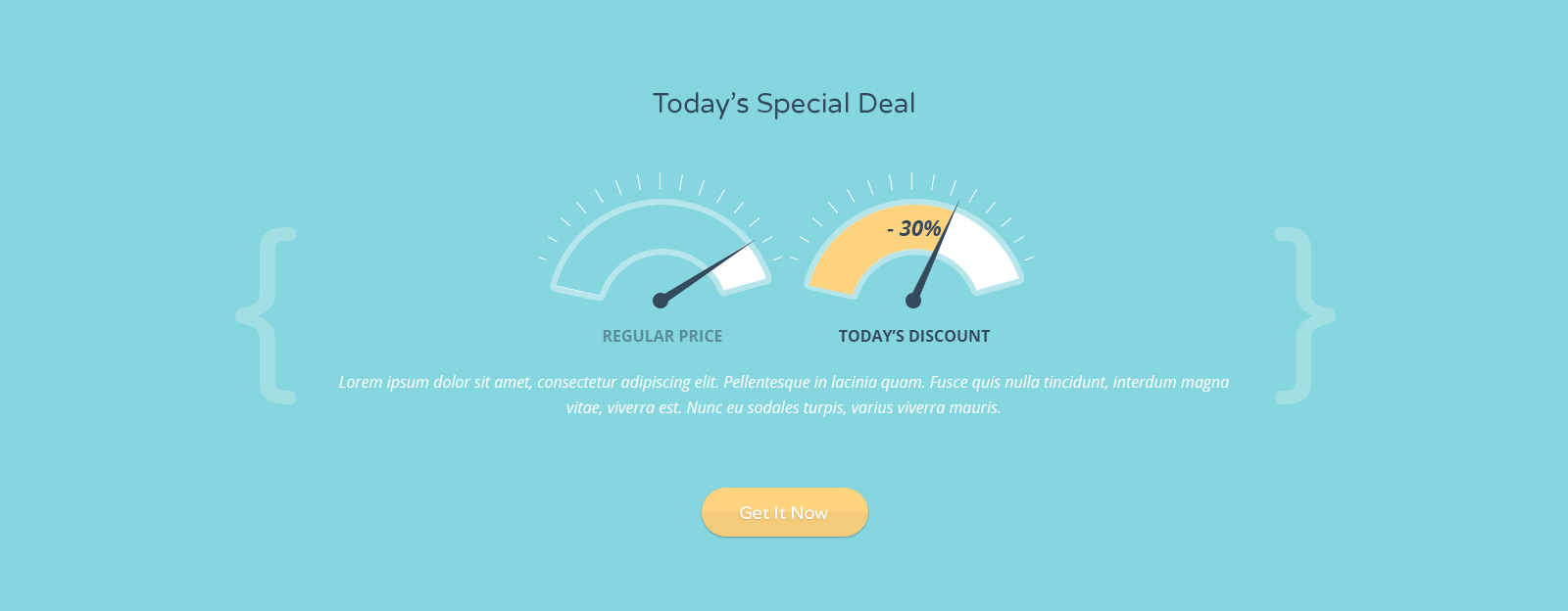
Here's an example of code that refers to Blog preview (full blog layout) in Allec template.
<h2 class="block-title block-title--top-larger">Our Recent Research</h2>
Using the code above in your page, you get style as shown in the screenshot below.
Result: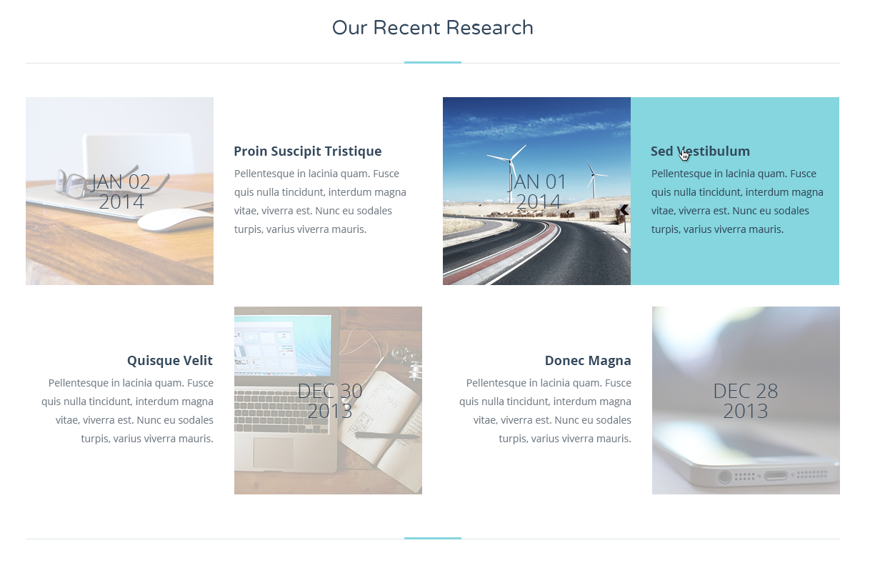
Here's an example of code that refers to Subscribe area in Allec template.
Join 51,000 community now and we’ll keep you posted!
Using the code above in your page, you get style as shown in the screenshot below.
Result:
Here's an example of code that refers to Pricing table area in Allec template.
<h2 class="block-title block-title--simple block-title--inverse">Choose Your Plan </h2>
<h4 class="price__package">{ 1 Gb }</h4>
- -
- -
- $ 19 per month
<h4 class="price__package">{ 5 Gb }</h4>
- -
- fermentum consequat
- $ 29per month
<h4 class="price__package">{ 10 Gb }</h4>
- dictum risus vel
- vel diam fringilla
- $ 39per month
<h4 class="price__package">{ 15 Gb }</h4>
- dictum risus vel
- fermentum consequat
- $ 49per month
Fusce in posuere lorem. Proin eleifend viverra orci, at blandit arcu feugiat mollis. Nunc congue erat ornare metus congue venenatis. Quisque sit amet leo tempor, adipiscing justo et, vulputate sapien. Donec tempus purus et vulputate faucibus.
Using the code above in your page, you get style as shown in the screenshot below.
Result: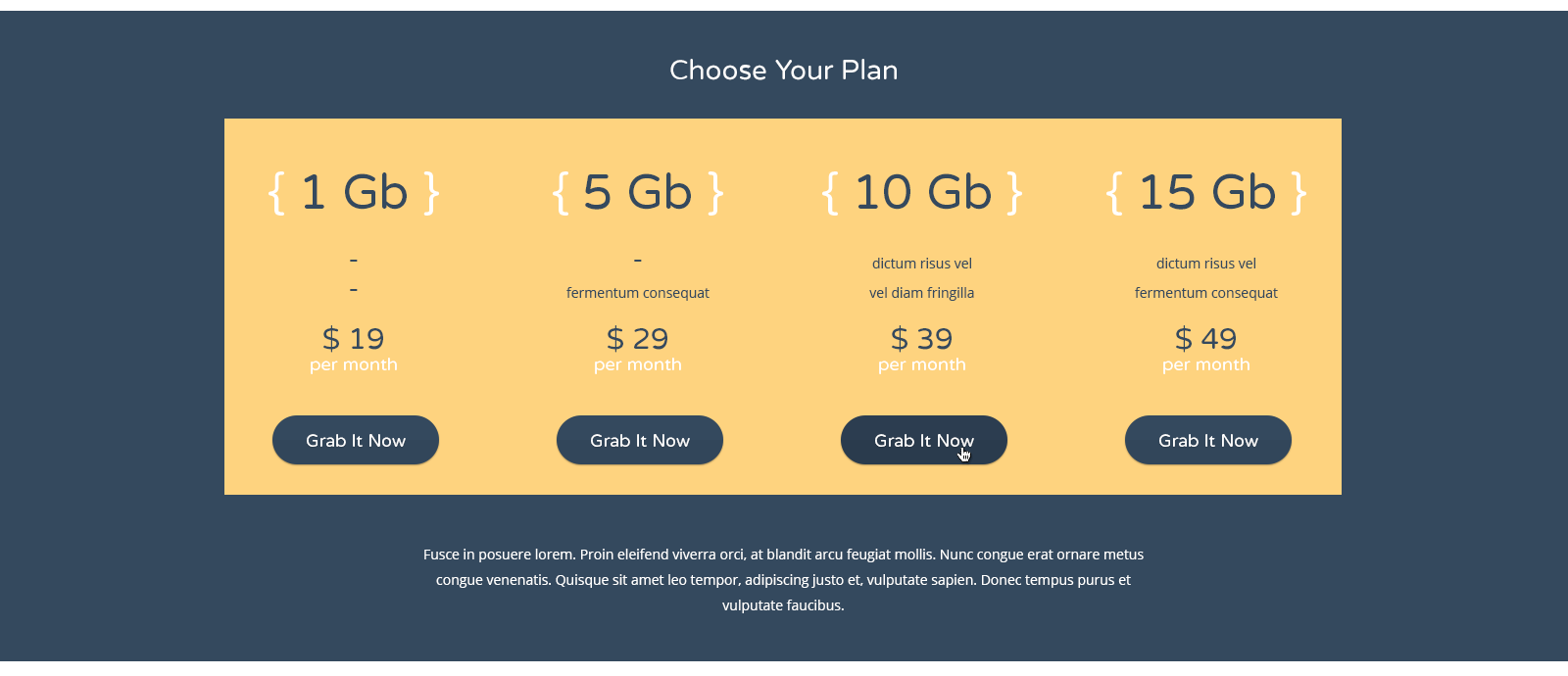
Here's an example of code that refers to Standard pricing table area in Allec template.
<h2 class="block-title block-title--simple" id="prices">Choose Pricing Plan</h2>
<h4 class="price__package">Basic</h4>
$12
monthly
- Limited Products
- 30 Staff Login
- 150 File Upload
- -
- Easy Control
<h4 class="price__package">standard</h4>
$22
monthly
- Limited Products
- 50 Staff Login
- 350 File Upload
- Technical Support
- Easy Control
<h4 class="price__package">advanced</h4>
$42
monthly
- Unlimited Products
- 70 Staff Login
- 550 File Upload
- Technical Support
- Easy Control
Using the code above in your page, you get style as shown in the screenshot below.
Result: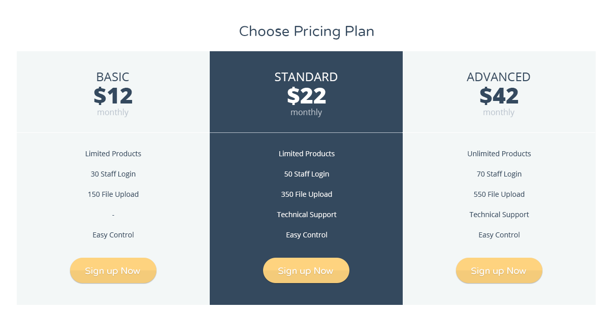
Here's an example of code that refers to Clients/Partners slider in Allec template.
<h2 class="block-title block-title--top-larger">Our Partners</h2>
Additionally you need to include javascript file at the bottom of the page (before closed tag <body>):
                        <script>
                            $(document).ready(function() {
                                sliderSides();
                            });
                        </script>
Using the code above in your page, you get style as shown in the screenshot below.
Result:
Here's an example of code that refers to Testimonial area in Allec template.
Testimonials
<h3 class="sub-header sub-header--simple">People who believe in us:</h3>
-
<img src="images/avatars/1.jpg" alt="">
CEO, Themeforest
“Donec euismod turpis id ullamcorper lobortis. Maecenas faucibus ipsum sem, sed consequat ante consectetur non. Nam at neque dui. Integer id risus sit amet justo varius semper quis ut enim.”
-
<img src="images/avatars/4.jpg" alt="">
CEO, Envato
“Aenean rutrum aliquet odio, ut posuere ante eleifend ac. Donec venenatis diam sapien, malesuada euismod diam rutrum a. ”
-
<img src="images/avatars/5.jpg" alt="">
CEO, Photodune
Quisque feugiat facilisis ipsum ut lobortis. Integer hendrerit sodales nisl nec tristique. Aenean commodo sapien ac tellus pharetra, quis tristique mi posuere.
-
<img src="images/avatars/2.jpg" alt="">
CEO, Themeforest
“Aenean rutrum aliquet odio, ut posuere ante eleifend ac. Donec venenatis diam sapien, malesuada euismod diam rutrum a. ”
-
<img src="images/avatars/3.jpg" alt="">
CEO, Themeforest
Quisque feugiat facilisis ipsum ut lobortis. Integer hendrerit sodales nisl nec tristique. Aenean commodo sapien ac tellus pharetra, quis tristique mi posuere.
-
<img src="images/avatars/1.jpg" alt="">
CEO, Themeforest
“Donec euismod turpis id ullamcorper lobortis. Maecenas faucibus ipsum sem, sed consequat ante consectetur non. Nam at neque dui. Integer id risus sit amet justo varius semper quis ut enim.”
-
<img src="images/avatars/4.jpg" alt="">
CEO, Envato
“Aenean rutrum aliquet odio, ut posuere ante eleifend ac. Donec venenatis diam sapien, malesuada euismod diam rutrum a. ”
<h3 class="sub-header sub-header--simple sub-header--mobile">Support our team:</h3>
Additionally you need to include stylesheet for this slider in <head> tag:
<link href="external/mCustomScrollbar/jquery.mCustomScrollbar.css" rel="stylesheet" />
And javascript file at bottom of page (before closed tag <body>):
                        <script src="external/mCustomScrollbar/jquery.mCustomScrollbar.concat.min.js"></script>

                        <script>
                            $(document).ready(function() {
                                scrollSlider();
                            });
                        </script>
Using the code above in your page, you get style as shown in the screenshot below.
Result: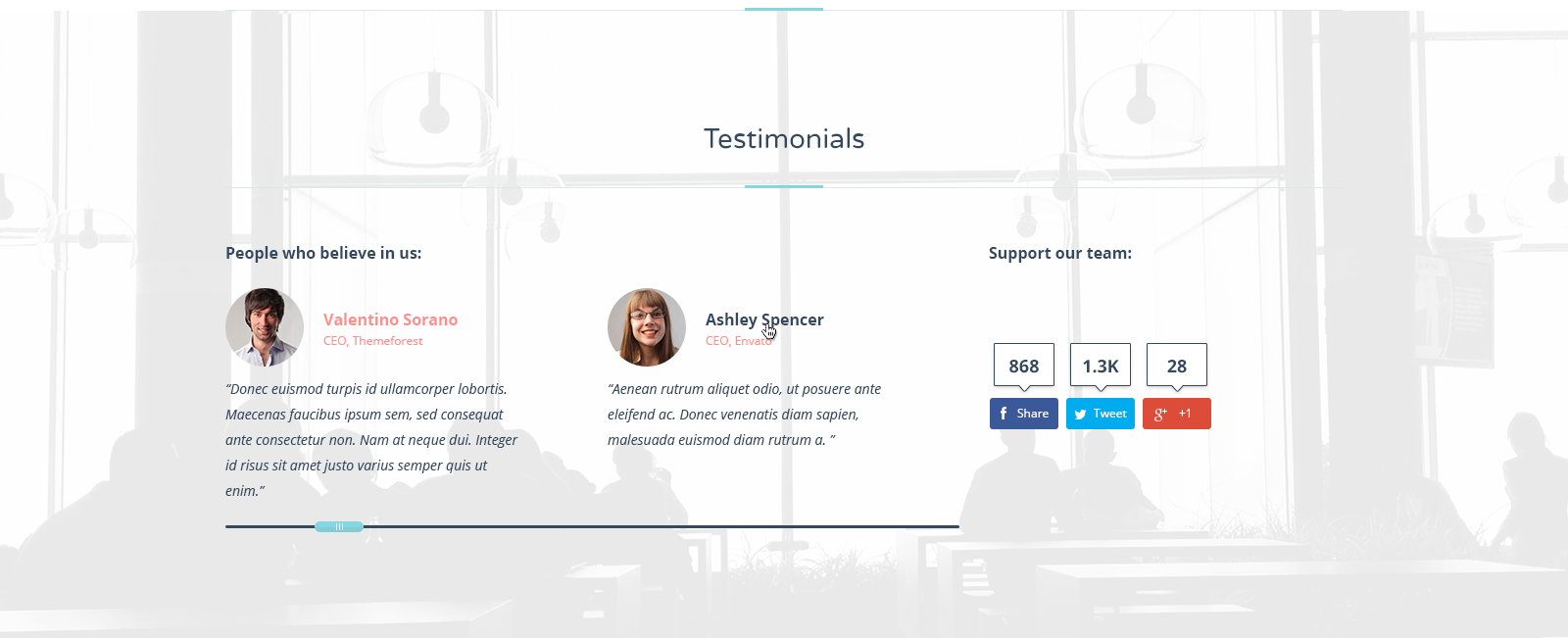
Here's an example of code that refers to Testimonial block without background and additional block in Allec template.
<h2 class="block-title block-title--top-larger">What people Say</h2>
-
<img src="images/avatars/20.png" alt="">
CEO, Themeforest
“Donec euismod turpis id ullamcorper lobortis. Maecenas faucibus ipsum sem, sed consequat ante consectetur non. Nam at neque dui. Integer id risus sit amet justo varius semper quis ut enim.”
-
<img src="images/avatars/4.jpg" alt="">
CEO, Envato
“Aenean rutrum aliquet odio, ut posuere ante eleifend ac. Donec venenatis diam sapien, malesuada euismod diam rutrum a. ”
-
<img src="images/avatars/2.jpg" alt="">
CEO, Photodune
Quisque feugiat facilisis ipsum ut lobortis. Integer hendrerit sodales nisl nec tristique. Aenean commodo sapien ac tellus pharetra, quis tristique mi posuere.
-
<img src="images/avatars/5.jpg" alt="">
CEO, Themeforest
“Aenean rutrum aliquet odio, ut posuere ante eleifend ac. Donec venenatis diam sapien, malesuada euismod diam rutrum a. ”
-
<img src="images/avatars/3.jpg" alt="">
CEO, Themeforest
Quisque feugiat facilisis ipsum ut lobortis. Integer hendrerit sodales nisl nec tristique. Aenean commodo sapien ac tellus pharetra, quis tristique mi posuere.
-
<img src="images/avatars/1.jpg" alt="">
CEO, Themeforest
“Donec euismod turpis id ullamcorper lobortis. Maecenas faucibus ipsum sem, sed consequat ante consectetur non. Nam at neque dui. Integer id risus sit amet justo varius semper quis ut enim.”
-
<img src="images/avatars/4.jpg" alt="">
CEO, Envato
“Aenean rutrum aliquet odio, ut posuere ante eleifend ac. Donec venenatis diam sapien, malesuada euismod diam rutrum a. ”
Additionally you need to include stylesheet for this slider in <head> tag:
<link href="external/mCustomScrollbar/jquery.mCustomScrollbar.css" rel="stylesheet" />
And javascript file at bottom of page (before closed tag <body>):
                        <script src="external/mCustomScrollbar/jquery.mCustomScrollbar.concat.min.js">

                        <script>
                            $(document).ready(function() {
                                scrollSlider();
                            });
                        </script>
Using the code above in your page, you get style as shown in the screenshot below.
Result: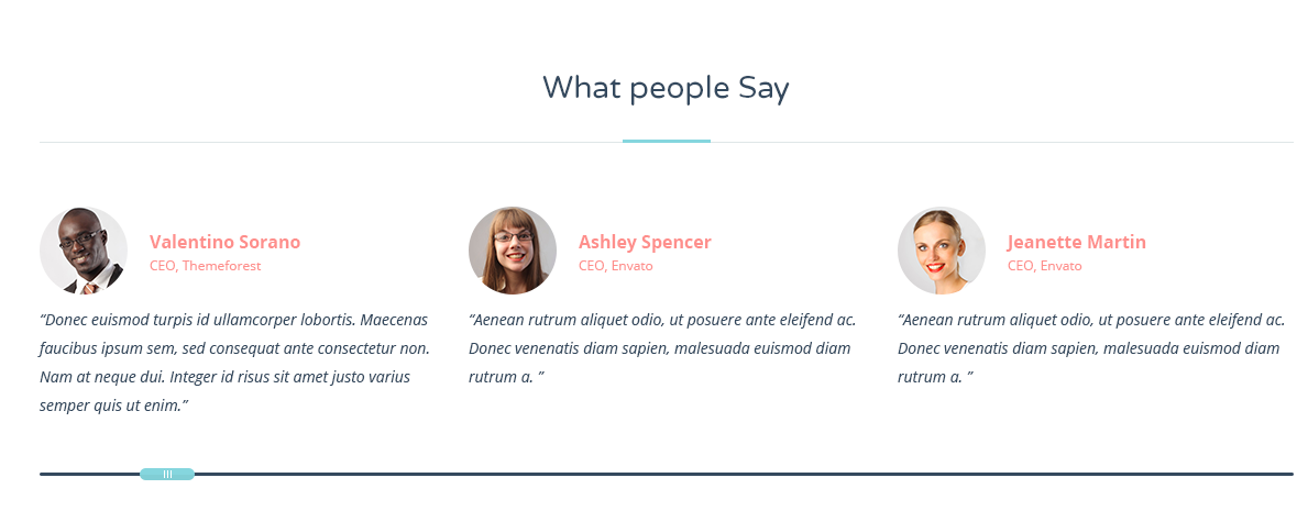
Here's an example of code that refers to Contact block in Allec template.
                                        Need Help?
                                        +1-888-555-5555
                                        Call Our Support Team 24/7
Using the code above in your page, you get style as shown in the screenshot below.
Result:
Here's an example of code that refers to Recent/Similar post block in Allec template.
<h2 class="heading-simple" id="projects">Recent Projects</h2>
Additionally you need to include javascript code at the bottom of the page (before closed tag <body>):
                        <script>
                            $(document).ready(function() {
                                itemCarousel();
                            });
                        </script>
Using the code above in your page, you get style as shown in the screenshot below.
Result:
Here's an example of code that refers to Achievement block in Allec template.
                                        <h4 class="achivement-item__heading">2nd place</h4>
                                        at International IT Competion


                                        <h4 class="achivement-item__heading">1st place</h4>
                                        on XX Annual Technology Conference


                                        <h4 class="achivement-item__heading">2nd place</h4>
                                        at Global Innovative Forum
Using the code above in your page, you get style as shown in the screenshot below.
Result:
Here's an example of code that refers to Default promobox in Allec template.
                            <h3 class="promo__heading">Designzway Team</h3>
                            We are on our way to perfection
                            Contact Us
Using the code above in your page, you get style as shown in the screenshot below.
Result:
Here's an example of code that refers to Brand promobox in Allec template.
                            <h3 class="promo__heading">1 452 clients</h3>
                            They’re satisfied. We’re happy
Using the code above in your page, you get style as shown in the screenshot below.
Result:
Here's an example of code that refers to parallax promobox with buttons in Allec template.
<h3 class="promo__heading">Sophisticated Solutions Here</h3>
Download Newest App
Using the code above in your page, you get style as shown in the screenshot below.
Result:
Note! You need to change background image in class-modificator promo--parallax to your own
Here's an example of code that refers to promobox with video in Allec template.
                            <video id='video-promo' class="media-element"  autoplay="autoplay" preload='none' loop="loop" muted="" src="../video/comp.mp4" >
                                <source type="../video/webm" src="video/comp.webm">
                                <source type="../video/mp4" src="video/comp.mp4">
                                <source type="../video/ogg" src="video/comp.ogv">
                            </video>

                            <h3 class="promo__heading">Watch and Admire</h3>
                            App Video Presentation
                            Learn More
Using the code above in your page, you get style as shown in the screenshot below.
Result:
Note! You need to change video sources in video tag to your own
Here's an example of code that refers to promobox with bubble canvas animation in Allec template.
                                <h3 class="promo__heading">Serching for something special?</h3>
                                Allec is everything you need for outstanding website
                                Try It Today
Additionally you need to include javascript files at the bottom of the page (before closed tag <body>):
                        <script src="../external/animated-header/js/TweenLite.min.js"></script>
                        <script src="../external/animated-header/js/EasePack.min.js"></script>
                        <script src="../external/animated-header/js/rAF.js"></script>
                        <script src="../external/animated-header/js/animation-bubble-fixed.js"></script>
Using the code above in your page, you get style as shown in the screenshot below.
Result:
Note! You need to change background image in class-modificator promo--canvas to your own
Allec Site Builder is 176 modular, clear and well separated functional components, which allow you to create multiple pages and save them. In full Site Builder documentation your find details about work and installation (Note! Before installation, you must create an empty database).
To be able to use AllecSite Builder, you must have the following:
If you want to work locally you can install, for example, Apache.
Allec Site Builder allows users to drag HTML elements onto a canvas and drop them where they'd like them to appear. Once dropped onto the canvas, the position can be changed by dragging and dropping as well. Elements can be deleted individually or all elements on the current page can be deleted in one go.
Allec Site Builder can also be used to edit almost all content inside each element (text, images, links, styles, videos, tables). This allows the user to click on any written text and change it (each element has a "reset" button as well which will return the element to its original state).
Allec Site Builder allows users to clone elements on the canvas.
With Allec Site Builder you can edit the source HTML of each block on the canvas.
Allec Site Builder allows users configure certain settings for an entire site, you can also configure certain settings for each page within a given site.
Allec Site Builder, also, allows users to export their sites at any given time and publish it to a live webserver using FTP. (Note! You can't export or publish your site in demo version. )
Here you can find the answers to most frequently asked questions regarding Allec template.
You need to declare these files to make main menu works:
All these files are included into pages.
For example, there is an html structure of main menu with menu level 2 and menu level 3:
Adding the code above you will get such kind of main menu as shown below.
Result:
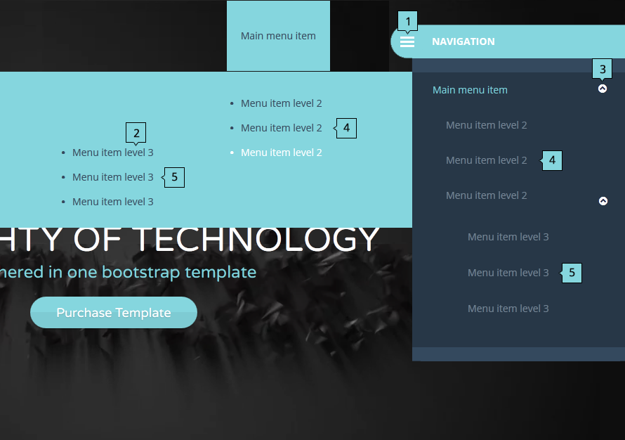
Function of each classes:
Initialization of main menu in custom.js begins in line 131. You can change:
For example:
                        triggerMenu: '.your-class',
                        subMenuTrigger: ".your-class-second",
                        animationSpeed: 850
In Allec template there are several specific sliders that need additional information about usage.
Each slider is initialized by own javascript function. These functions are located in custom.js (path js/custom.js):
If you want to use the slide,you need to declare the appropriate function on the page with the corresponding html for this slide. This function is declaring at the bottom of the page, before closing <body>. For example:
                        <script>
                            $(document).ready(function() {
                            staffSlider();
                            });
                        </script>
Please go through the following steps to switch it at your page
<link href="css/boxed.css?v=1" rel="stylesheet" />
Please go through the following steps to switch RTL version at your page
<link href="css/style-rtl.css?v=1" rel="stylesheet" />
Allec Template has embedded Ecwid E-commerce Shopping Cart from Ecwid. All you need is to copy “Store ID” and paste it into shop-ecwid.html. Go through the following steps to get working shop:
<script type="text/javascript" src="http://app.ecwid.com/script.js?1003" charset="utf-8"></script>
More information about Ecwid can be found at Ecwid forum and Ecwid help center.
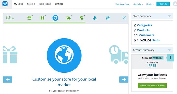
Livicons are animated vector icons. Please go through the following steps to enable them in your page.
                                    <script src="raphael-min.js">
                                    <script src="livicons-1.2.min.js">
<i class="livicon" data-name="comments" data-color="#34495e" data-hovercolor="#34495e"></i>
initMap() (line 1069) - classic mapinitMapVintage() (line 1099) - black and white mapinitMapLocation() (line 1202) - grey and white map.new google.maps.LatLng. This is a center of each map. This code is located in different lines depending on what function of mentioned above is used in the site:
initMap() - line 1074.initMapVintage() - line 1104.initMapLocation() - line 1207.'40.717729,-74.006648' to your own. You can find an appropriate value at Google Maps GPS Coordinates
Also, You can add your own marker.
For example:
var myIconB = new google.maps.MarkerImage( “PATH TO YOUR ICON”, null, null, null, new google.maps.Size(57,64));
Here’s a list of lines of code where you can change icon path:
initMap() - line 1085.initMapVintage() - line 1115.initMapLocation() - line 1218.More details about Google maps customization are at official Google Developers website
Allec template contains fully working contact form. All you need is to insert your actual e-mail address:
"YOUR_EMAIL_HERE" (line 13) If you want to add a new field to contact form go through the following steps:
var $address = self.find('[name=contact-address]');
                                        if($address.val().length>2 && $address.val()!= $address.attr('placeholder')) {
                                           $address.removeClass('invalid_field');
                                        }
                                        else {
                                           createErrTult('There is no any address.', $address)
                                           error++;
                                        }
This will generate error if field is empty. You can change createErrTult() (line 6 in example above) first argument which is an error message.
$address = $_POST["contact-address"];
contact-address - a name of a newly created field
$address into variable $text (this is a text that you get in email when user sends the message via your contact form). For example:
                                $text = "Name: $name

                                Email: $email

                                Address: $address

                                Message: $message";
Allec Template has embedded subscribe form from Mailchimp. All you need is to copy “action URL” and paste it into subscribe forms in your pages. Go through the following steps to get working subscribe form:
<form> and copy action value [6].After these actions are done, newly created form will subscribe users to chosen list in your account.
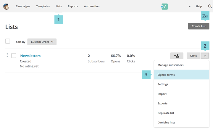

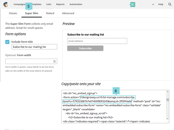

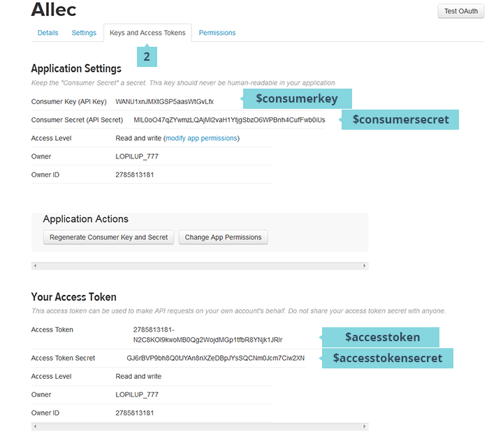
$twitteruser = ""; (line 5)$consumerkey = ""; (line 7)$consumersecret = ""; (line 8)$accesstoken = ""; (line 9)$accesstokensecret = ""; (line 10)For example:
                                $twitteruser = "@OliaGozha";
                                $consumerkey = "oN4CjnK9b9UPYKhtdYng";
                                $consumersecret = "T2IjQ7gyhfmNwv0mUF3piYWZIoTgn7e4f8jbf1I9wU";
                                $accesstoken = "89252733-7jIxFePY4shQbTArc5m0vojMIP7qs8niTqEjYKuPQ";
                                $accesstokensecret = "3awDk0mUIenFkfEH9tER4VOLpi3XMJqxSBfosLfNJypgl";
twitterprofile = ""; (line 6)screenname = ""; (line 7)For example:
                                var twitterprofile = "OliaGozha";
                                var screenname = "OliaGozha";
Note! This is a technology for twitter stream using php for last news. For correct work you need any kind of php server for debugging website.
disqus_shortname and copy value [7].
                                var twitterprofile = "OliaGozha";
                                var screenname = "OliaGozha";
disqus_shortname in copied value in step 5.More information can be found at Disqus support page

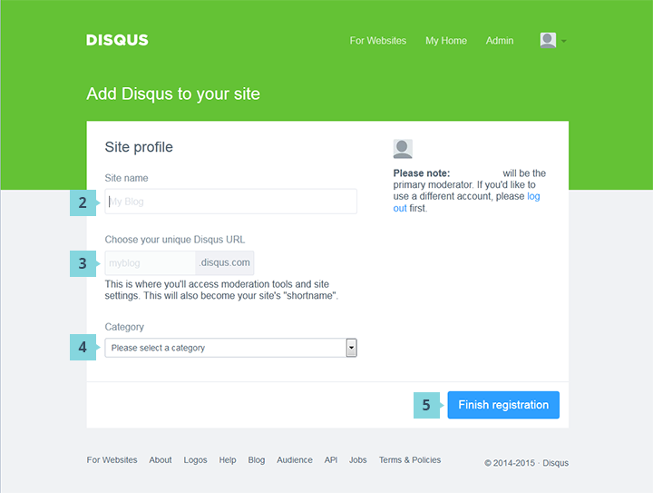
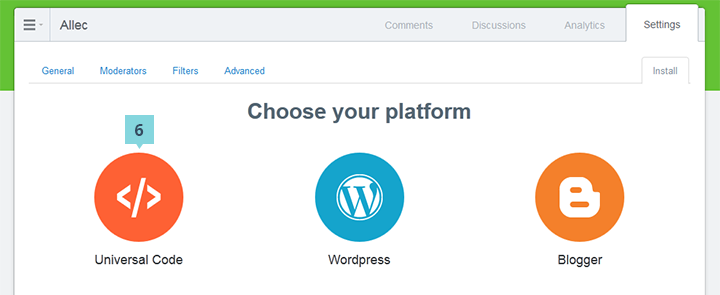
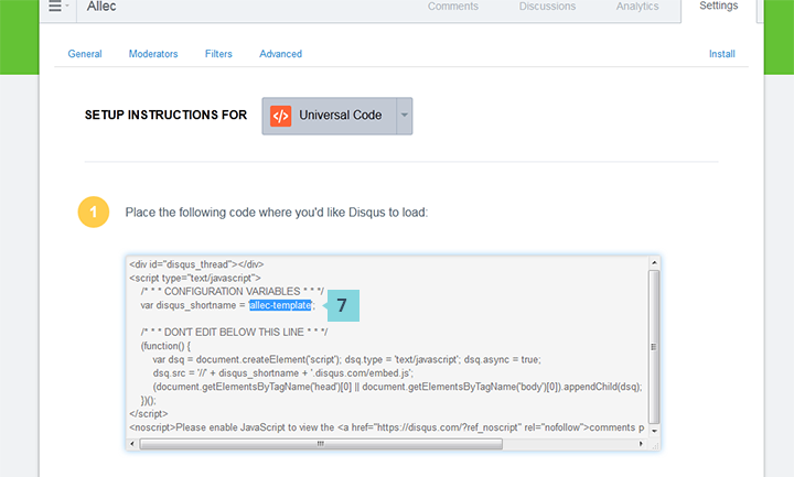
You probably have compatibility issue with the database.
To fix the issue, simply run the following SQL statements on your Site builder database:
                            ALTER TABLE `pages` ADD `pages_preview` TEXT NOT NULL AFTER `pages_header_includes`;
                            ALTER TABLE `pages` ADD `pages_template` INT(1) NOT NULL DEFAULT '0';
                            ALTER TABLE `frames` ADD `frames_sandbox` INT(1) NOT NULL DEFAULT '0' AFTER frames_original_url;
                            ALTER TABLE `frames` ADD `frames_loaderfunction` VARCHAR(255) NOT NULL AFTER frames_original_url;
To assign the values in Numbers block (counters) you should:
                                   download
                                   0
data-result (that is the final value and it can take different formats: number and string) and data-value (that is the value up to which you should count in script execution, it takes only numeric format) for the container.For Progressbar block you should:
UX/UI: 0%
data-level (that is a value within 0 and up to hundred which a script should count, it is also a final result) for the element.id (line 871). For example:
qstrings: {id: '52617155@N08'},
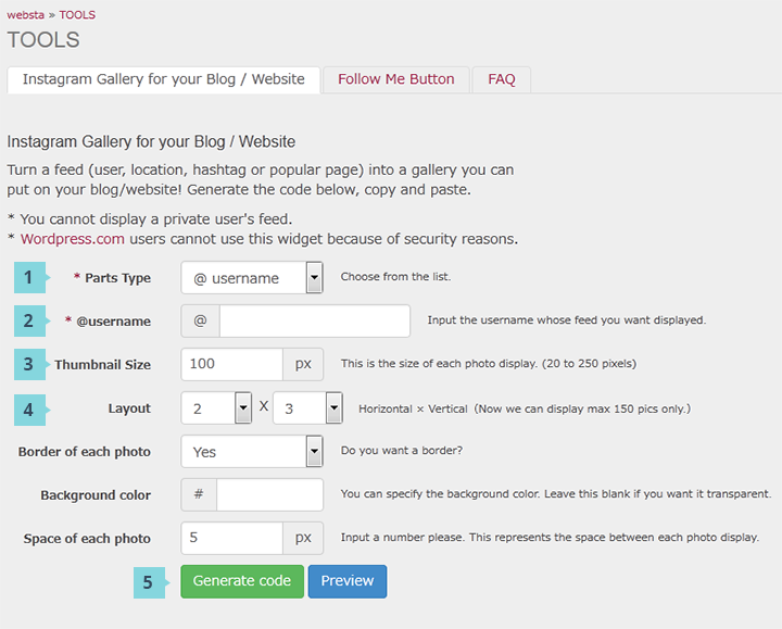
                                <script>
                                    $(document).ready(function() {
                                            //CountDown
                                            var dateOfBeginning = "Jan 20, 2015",
                                                  dateOfEnd = "Dec 28, 2015";

                                            countDown(dateOfBeginning, dateOfEnd);
                                        });
                                </script>
dateOfBeginning - date of the beginningdateOfEnd - date of the endTo set time on Coming soon page in Site Builder you need:
                                dateOfBeginning = "Jan 20, 2015", //type your date of the Beginnig
                                dateOfEnd = "Dec 28, 2015"; //type your date of the end